
Map Info & Chart : Three Ways to Visualize American Income Inequality
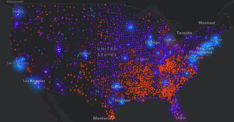
Three Ways to Visualize American Income Inequality
By novoblade
At infographic.tv we provide handpicked collection of the best infographics and data charts from around the world.

Loading…