in

Map : Blue and Red areas have equal population

Map Info & Chart : Blue and Red areas have equal population
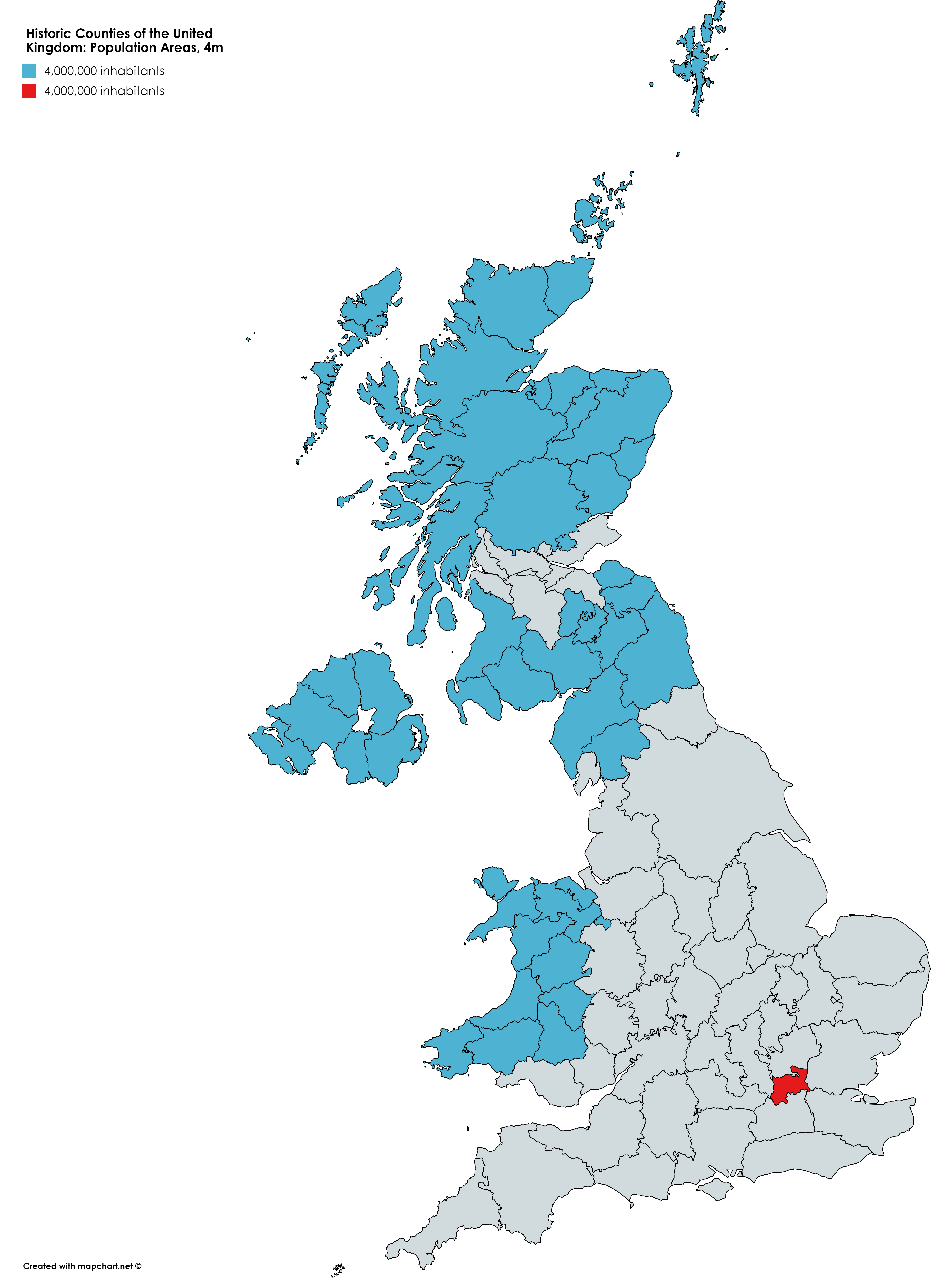
Blue and Red areas have equal population

By I_Love_Lisa_Simpson

At infographic.tv we provide handpicked collection of the best infographics and data charts from around the world.

  • Sharing is caring !
  • What do you think?

    459 points
    Upvote Downvote

    Leave a Reply

    Your email address will not be published. Required fields are marked *

    Loading…

    Infographic : Top 11 Most Powerful Digital Marketing Trends To Follow In 2019

    Map : The Vatican compared compared to Russia.