in

Map : The Vatican compared compared to Russia.

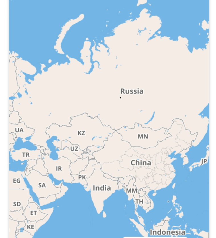
Map Info & Chart : The Vatican compared compared to Russia.

The Vatican compared compared to Russia.

By MrMelon03

At infographic.tv we provide handpicked collection of the best infographics and data charts from around the world.

  • Sharing is caring !
  • What do you think?

    459 points
    Upvote Downvote

    Leave a Reply

    Your email address will not be published. Required fields are marked *

    Loading…

    Map : Blue and Red areas have equal population

    Map : [OC] Whole milk vs semi-skimmed vs skimmed in Europe [3229×2626]