in

data visualization : Graph of expected seats vs actual for US political parties in congress. Expected calculated from percent of total vote nationally multiplied by 435. Data courtesy of wikipedia. [OC]
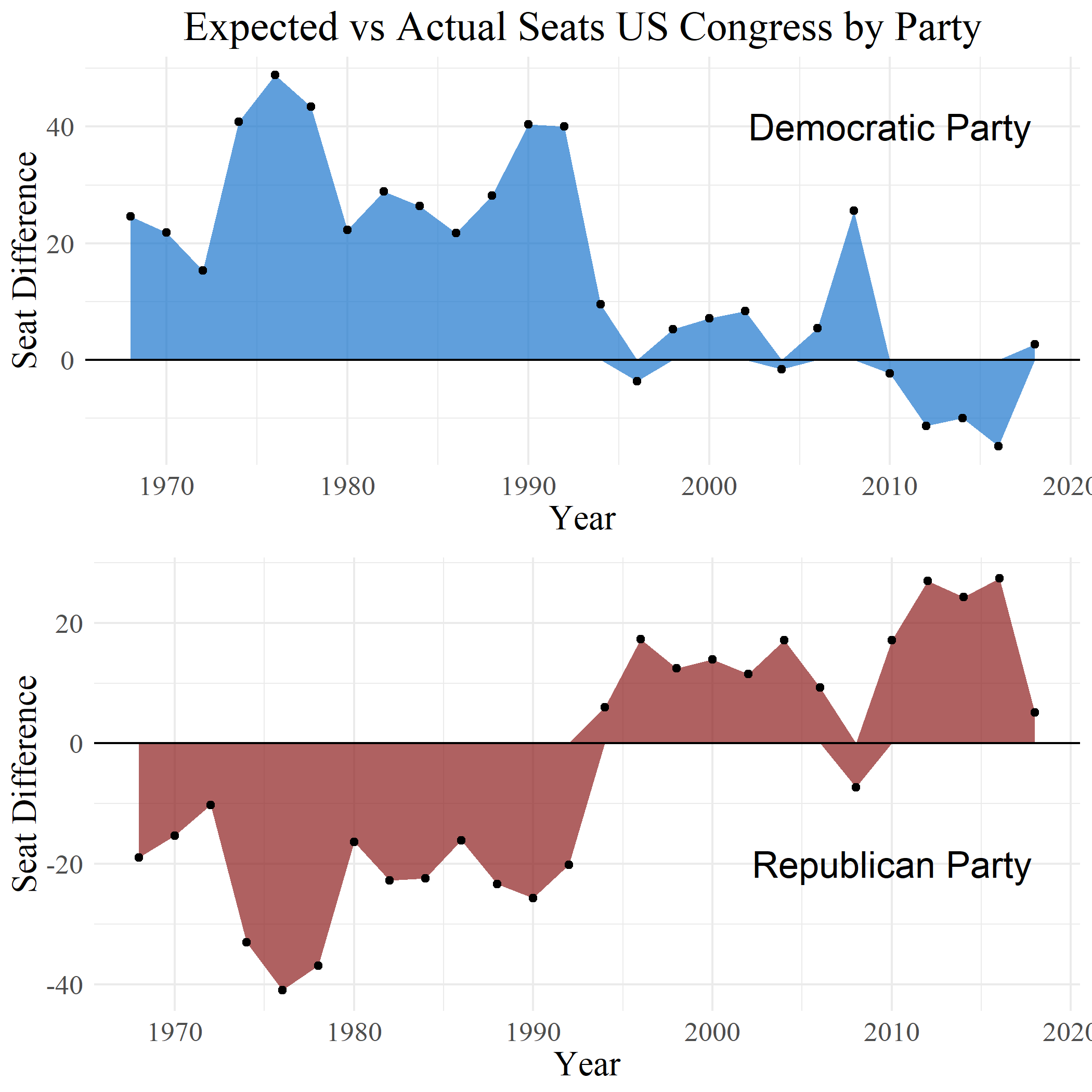
Data visualization : Graph of expected seats vs actual for US political parties in congress. Expected calculated from percent of total vote nationally multiplied by 435. Data courtesy of wikipedia. [OC]

Graph of expected seats vs actual for US political parties in congress. Expected calculated from percent of total vote nationally multiplied by 435. Data courtesy of wikipedia. [OC]

By tex2hard

At infographic.tv we provide handpicked collection of the best infographics and data charts from around the world.

  • Don’t forget to share the love !
  • What do you think?

    463 points
    Upvote Downvote

    Leave a Reply

    Your email address will not be published. Required fields are marked *

    Loading…

    Data Chart : 55 SEO Tips For Small Business Owners [Infographic

    Video Infographic : Why Does Getting Kicked in the Testicles Hurt So Badly?