Data visualization : Graph of expected seats vs actual for US political parties in congress. Expected calculated from percent of total vote nationally multiplied by 435. Data courtesy of wikipedia. [OC]
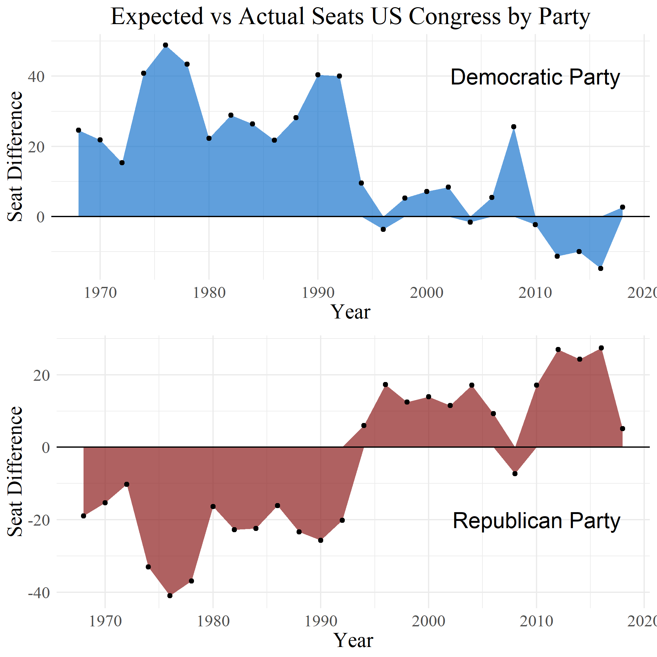
Graph of expected seats vs actual for US political parties in congress. Expected calculated from percent of total vote nationally multiplied by 435. Data courtesy of wikipedia. [OC]
By tex2hard
At infographic.tv we provide handpicked collection of the best infographics and data charts from around the world.