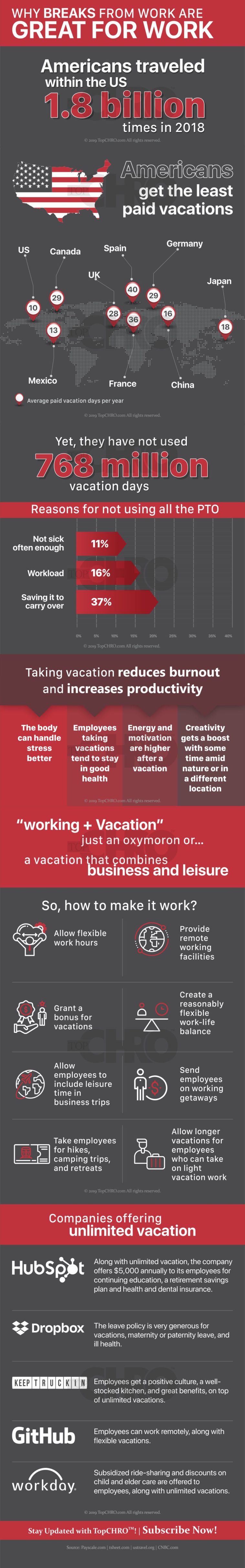
Infographic : Americans appear to have a serious aversion for paid time off (PTO) if recent facts are anything to go by. Their 1.8 billion domestic leisure trips in 2018 brought in $650 billion and support for 5.5 million American jobs; however, they did not use 768 million days of PTO, up by 9% from 2017.

Americans appear to have a serious aversion for paid time off (PTO) if recent facts are anything to go by. Their 1.8 billion domestic leisure trips in 2018 brought in $650 billion and support for 5.5 million American jobs; however, they did not use 768 million days of PTO, up by 9% from 2017.
By ariaareeds02
Information graphics, visual representations of data known as infographics, keep the web going these days. Web users, with their diminishing attention spans, are inexorably drawn to these shiny, brightly coloured messages with small, relevant, clearly-displayed nuggets of information. They’re straight to the point, usually factually interesting and often give you a wake-up call as to what those statistics really mean.
At infographic.tv we provide handpicked collection of the best infographics and data charts from around the world.