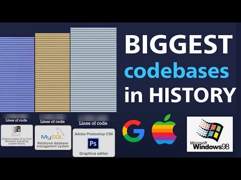
Infographic : From 4,500 lines of code to 2 billion, we created a timeline animation out of the largest codebases in the history of tech, measured with lines of code. Enjoyable for non-developers, too 🙂
YouTube link: [https://youtu.be/afEg6VuAQJQ](https://youtu.be/afEg6VuAQJQ)
For coding friends in the sub, source: [https://docs.google.com/spreadsheets/d/1s9u0uprmuJvwR2fkRqxJ4W5Wfomimmk9pwGTK4Dn_UI/edit#gid=5](https://docs.google.com/spreadsheets/d/1s9u0uprmuJvwR2fkRqxJ4W5Wfomimmk9pwGTK4Dn_UI/edit#gid=5)
By _leznets
Information graphics, visual representations of data known as infographics, keep the web going these days. Web users, with their diminishing attention spans, are inexorably drawn to these shiny, brightly coloured messages with small, relevant, clearly-displayed nuggets of information. They’re straight to the point, usually factually interesting and often give you a wake-up call as to what those statistics really mean.
At infographic.tv we provide handpicked collection of the best infographics and data charts from around the world.