in

data visualization : Global warming at different latitudes. X axis is range of temperatures compared to 1961-1990 between years shown at that latitude [OC]

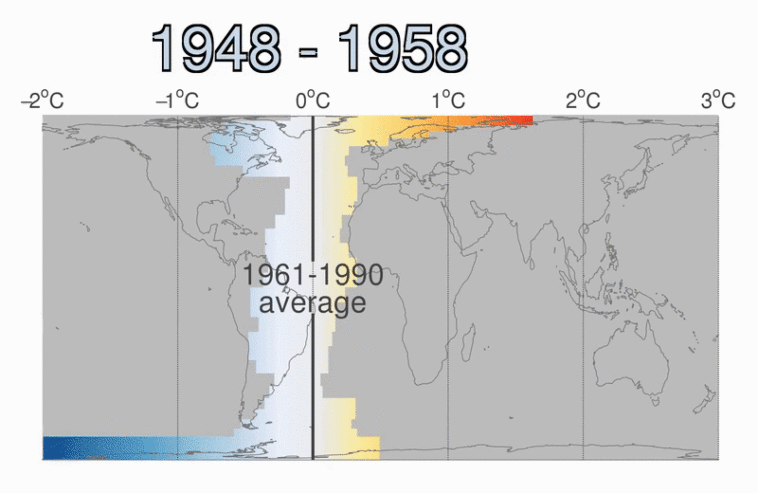
Data visualization : Global warming at different latitudes. X axis is range of temperatures compared to 1961-1990 between years shown at that latitude [OC]

Global warming at different latitudes. X axis is range of temperatures compared to 1961-1990 between years shown at that latitude [OC]

By neilrkaye

At infographic.tv we provide handpicked collection of the best infographics and data charts from around the world.

  • Don’t forget to share the love !
  • What do you think?

    459 points
    Upvote Downvote

    Leave a Reply

    Your email address will not be published. Required fields are marked *

    Loading…

    Map : Loe effort Nord VPN map, Bosnia took Croatian coast, all microstates 1000% bigger

    Data Chart : Truck Accidents [Infographic