in

data visualization : Historical Global Atmospheric Oxygen Levels Graph – Data is also very meaningful

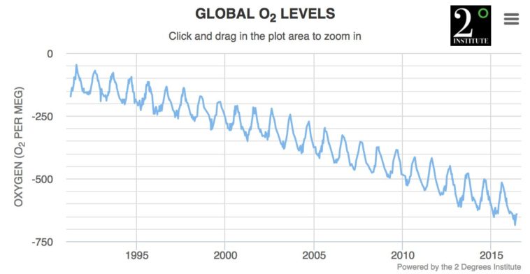
Data visualization : Historical Global Atmospheric Oxygen Levels Graph – Data is also very meaningful

Historical Global Atmospheric Oxygen Levels Graph – Data is also very meaningful

By HolyPhoenician

At infographic.tv we provide handpicked collection of the best infographics and data charts from around the world.

  • Don’t forget to share the love !
  • What do you think?

    459 points
    Upvote Downvote

    Leave a Reply

    Your email address will not be published. Required fields are marked *

    Loading…

    Map : This map of the UK is awful.

    Data Chart : 5 Easy Breakfasts You Can Make The Night Before [Infographic