Data visualization : Mapping the Chicago Neighborhoods Most at Risk From Pollution
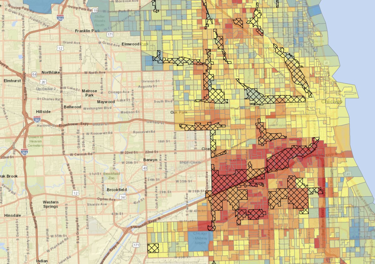
Mapping the Chicago Neighborhoods Most at Risk From Pollution
By EnigmaTrain
At infographic.tv we provide handpicked collection of the best infographics and data charts from around the world.