in

data visualization : My mood every day during 2018 compared to 2017

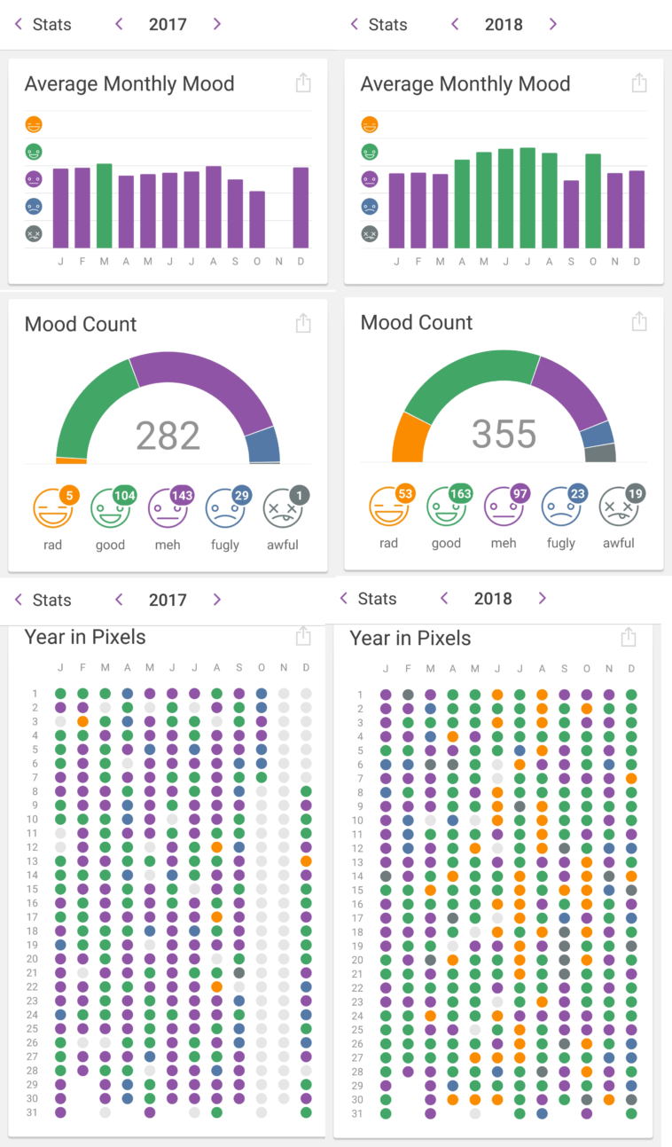
Data visualization : My mood every day during 2018 compared to 2017

My mood every day during 2018 compared to 2017

By MyUsernameIsNotCool

At infographic.tv we provide handpicked collection of the best infographics and data charts from around the world.

  • Don’t forget to share the love !
  • What do you think?

    459 points
    Upvote Downvote

    Leave a Reply

    Your email address will not be published. Required fields are marked *

    Loading…

    Visual : Warning Signs of “Christian” Cults

    Data Chart : The Evolution of Black Panther From 1965 – Today [Infographic