Data visualization : Percentage of Each Australian State’s Population Living in its Most Populous City [OC]
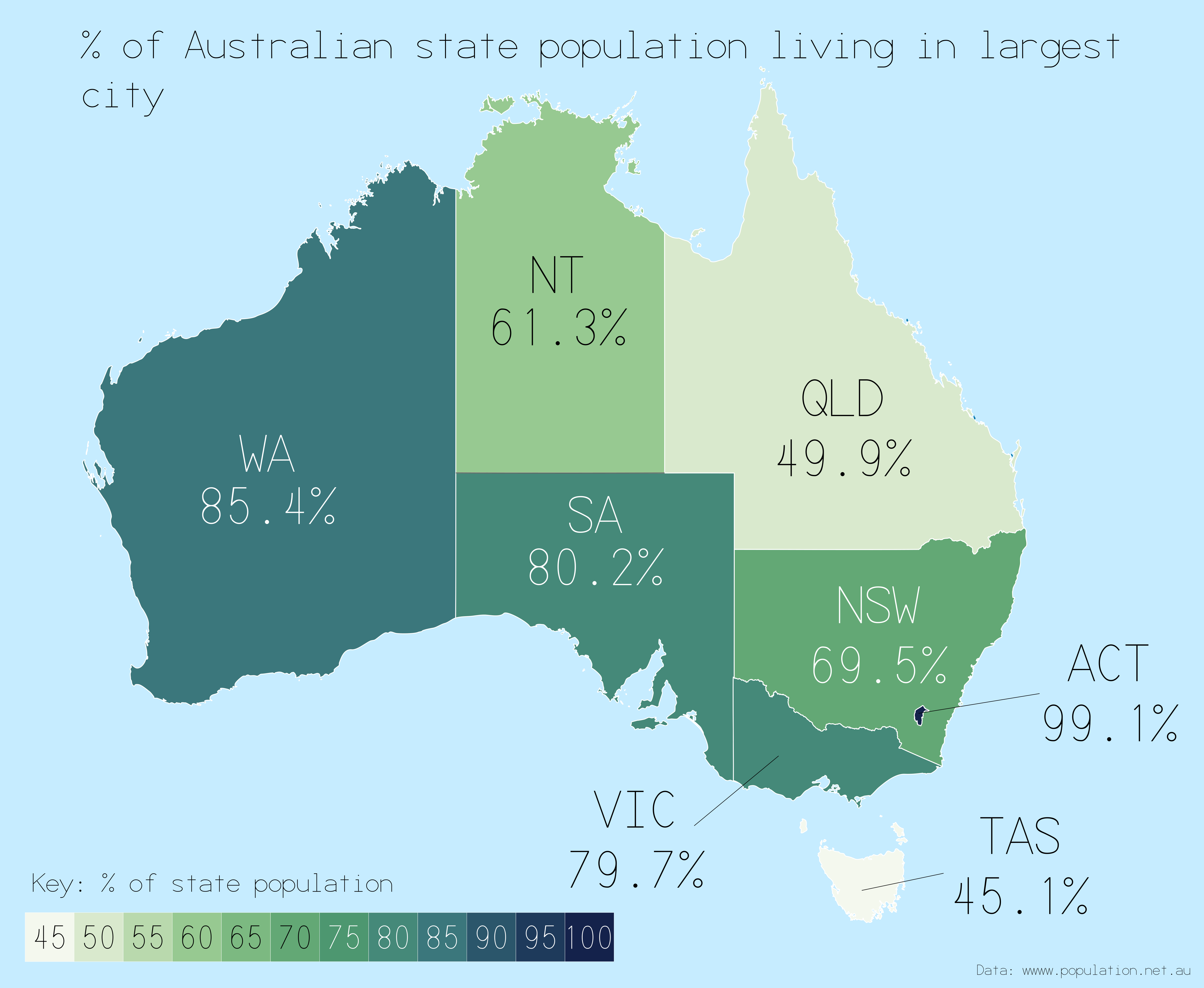
Percentage of Each Australian State’s Population Living in its Most Populous City [OC]
By wunty
At infographic.tv we provide handpicked collection of the best infographics and data charts from around the world.