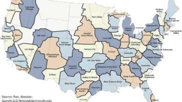
in Map Map : What the 50 US states might look like if they were redrawn today based on economic connections [1484×982]
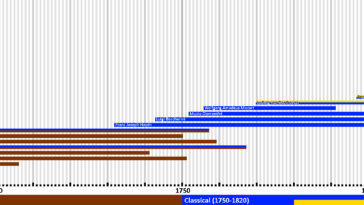
in Infographics data visualization : Timeline of the most famous Baroque, Classical, Romantic and Modernist composers [OC]
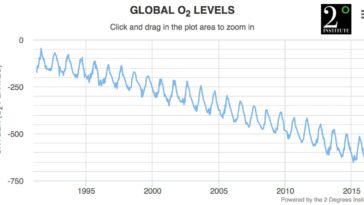
in Infographics data visualization : Historical Global Atmospheric Oxygen Levels Graph – Data is also very meaningful