Infographic : 10 significant visualisation developments: January to June 2019
To mark each mid-year and end-of-year milestone I take a reflective glance over the previous 6-month period in the data visualisation field and compile a collection of some of the most significant developments. These are the main projects, events, new sites, trends, personalities and general observations that have struck me as being important to help further the development of this field or are things I simply liked a great deal. Here’s the full compilation of all my collections.
In February I published a collection for the second 6 months of 2018 and now I’d like to reflect on the first 6 months of 2019. I look forward to hearing from you with suggestions for the developments you believe have been most significant.
And so, as ever, in no particular order…
1. Data Visualisation Society

The Data Visualization Society was launched in February as a new community for this field to offer the space and the place to help people learn from one another, perhaps in a collaborative and conversational way that is not already covered by the platforms in which most content is published (Twitter, blogs). Founded by Amy Cesal, Elijah Meeks and Mollie Pettit, its mission is to ‘foster a community where every member benefits from resources that support growth, refinement, and expansion of data visualization knowledge regardless of expertise level’. In its first few months the DVS has gone from strenth-to-strength, with an almost-overwhelmingly vibrant Slack workspace comprising over 6000 members and a dedicated Medium platform ‘Nightingale’.
2. Sonja Kuijper’s ‘A View on Despair’
This is a stunning piece of visual representation but about a deeply sad and personal subject matter (visit the full size version for true impact). Created by Sonja Kuijpers to shine a light on the tragedy of depression and suicide, the abstract landscape creates a canvas portraying the 1917 different people who committed suicide in the Netherlands during the year 2017. Each method of suicide is represented by different visual elements, varied further to depict the age groups. Sonja’s courage in presenting the background to this work is remarkable and inspiring in equal measure, and the companion design process narrative is a must read in its own right.
3. The Economist
Over the past 12 months, under the various stewardship roles of Phil Kenny (former Head of Design), Alex Selby-Boothroyd (Head of Data Journalism) and Graham Douglas (Head of Graphics), the quantity and quality of the print graphics and digital interactives output from the data journalist team at The Economist has risen to an exceptionally high level. They should be included in any conversation about where the finest visualisation work is being produced from, and I’ve been really impressed with some of their particularly novel representaiton approaches (example 1, example 2, example 3). One of my favourite articles of the year related to their critical reflections about the previous graphical mistakes they have made. Also check out this recent insightful Reddit AMA with Evan Hensleigh and Martín González.
4. Bar chart races
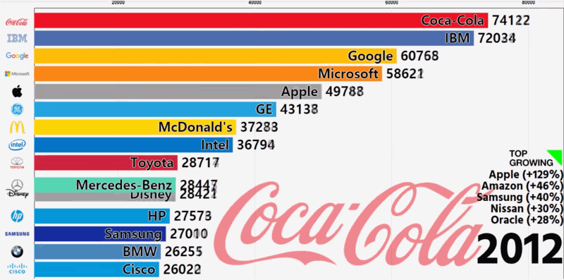
The bar chart race – an animated bar chart showing changing values and ranks of categories over time – burst on to the scene (I think) around February of this year with the above race showing the changing nature of dominant global brands (as tweeted here). Since then you can’t have failed to encounter spin off applications popping up across social media (not just data vis social media). John Burn-Murdoch was the man behind one of the most viral with his version about the changing ranks of the 10 biggest cities in the world since 1500, as viewed by over 2.7m people (and check out his astute observations about their power/limits). John published his code via Observable and the folks at Flourish studio then took this on and integrated it as a new feature in their visualisation tool. I’ve seen them used on sports and news coverage on TV since then, reinforcing their mainstream appeal.
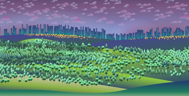
5. Climate visualisations
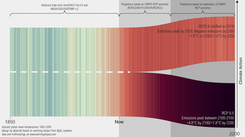
With the urgency and focus on the climate change emergency (*hopefully*) starting to increase, I feel it is coinciding with and/or being partly influenced by an era of excellent visualisation work about this and related subjects from subject experts and graphics professionals alike. Just a few of my favourites works from Alexander Radtke (as shown above), Axios, The Guardian, SCMP, anything by Ed Hawkins, anything also by Neil Kaye, Washington Post, Robert Rohde, Reuters, and the New York Times to name but a few. A special mention also to Ken Black for his incredible body of self-initiated exploration work in to the subject of climate change, and a pointer towards a pair of interesting articles/papers ‘Exploring the Design Space of Engaging Climate Change Visualizations for Public Audiences’ and ‘The Climate Spiral Demonstrates the Power of Sharing Creative Ideas’.
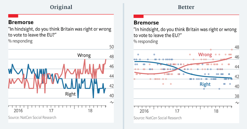
6. ONS “Say What You See”
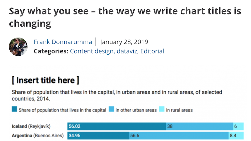
This might seem a minor and rather small item to include in this list but I think it is significant that an organisation like the UK’s Office for National Statistics (ONS) has taken this stance of ‘saying what they see’ in chart titles. Navigating the demands for impartiality can be a difficult matter for such organisations (I’d throw the BBC into the same mix) and so this more confident approach should be seen as a benchmark for others to emulate. As Frank Donnarumma describes in this explanation piece “Currently, most of the chart titles used across the ONS are purely statistical, signposting the data within the chart and nothing more… Good titles have been shown to make messages in charts more memorable, so going forward, we want our chart titles to be more descriptive. We want to communicate with clarity and speed”.
7. FT Data Crunch
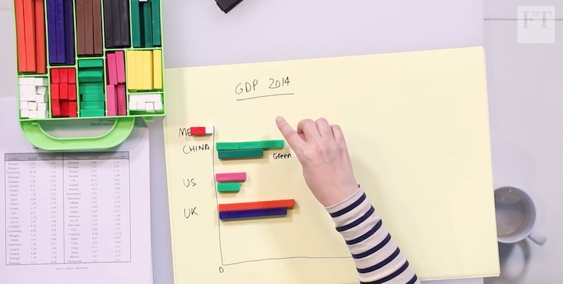
I really like this new series of video explainers produced by the FT and starring Federica Cocco and (second mention!) John Burn-Murdoch. In each video, they “dig into the numbers behind divisive issues” using hand-drawn visuals to drive the discussion. You can watch the full series of videos here.
8. Nicholas Rougeux’s ‘Illustrations of the Natural Orders of Plants’
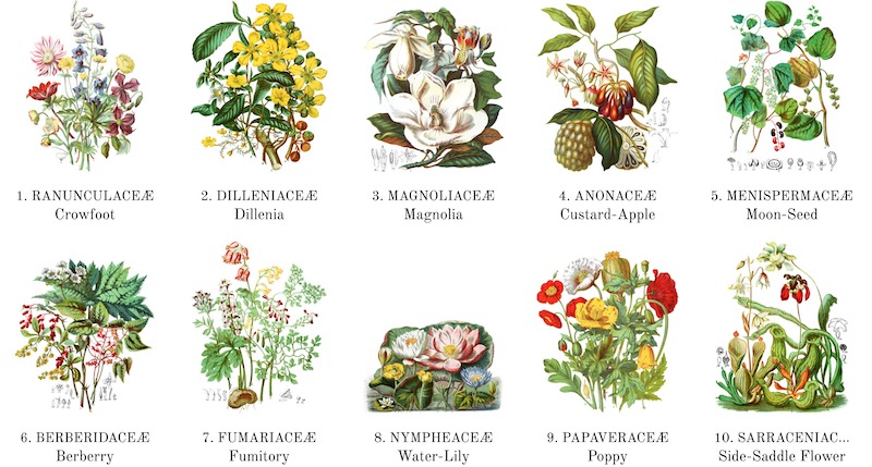
Nicholas has been one of my favourite visualisation designers for a few years now and this is another masterpiece from his production line. Maybe THE masterpiece. It is a beautifully intricate digital reproduction and enhancement of Elizabeth Twining’s celebrated two-volume catalog from 1868 “Illustrations of the Natural Orders of Plants”. You can browse the hand-drawn illustrations, order posters, and read the best-in-class ‘making of’ article.
9. Acquisitions of Tableau and Looker
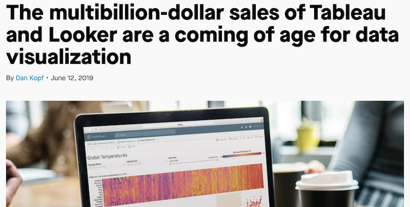
In the space of just a few days in June came news of two major acquisitions in the visualisation/analytics technology space. Firstly, based on my radar rather than chronology, Tableau announced it was being bought by Salesforce for $15.7bn. This followed news of Google acquiring Looker for $2.6bn. (I mention this latter story reached me after the Tableau news because – and I’m still surprised by this – I had never previously heard of Looker). What impact this will have on the visualisation tool marketplace, on the existing users of each platform and of the direction of the field at large remains to be seen but clearly this is a major milestone in the field’s timeline given both the size of the investments and the names of the companies involved (I have clearly heard of Google…).
10. Zeit Online
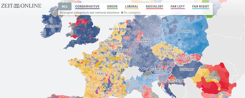
Led by Julius Tröger, and with a team packed-full of talent, the visual journalism and interactive departments at Zeit Online (the digital sister to the Die Zeit weekly newspaper) are producing some of the very best visualisation work (anywhere, not just in Europe). Pieces like ‘Europe from Left to Right’ (shown above), ‘The Millions Who Left Us’ and ‘Split Country’ (all translated titles) are just some of the recent examples that demonstrate their visual and editorial skills, with their particularly strong flair for spatial analysis.
Special mentions…
Here are the other highlights from the first half of 2019 that deserve a special mention:
Paths to Congress | Developed for the New York Times by Sahil Chinoy and Jessia Ma, this is an amazing depiction of the academic and career paths that the members of the House of Representatives took to Congress. Also check out the glorious print version and a super podcast episode with the creators.
The British-Irish Dialect Quiz | Just as its American-dialect predecessor did in late 2013, this project went super viral in February – not surprisingly as us Brits and Irish are somewhat obsessed by our dialect tribes.
Equal Earth | This is an important new mapping projection that offers physical maps and digital resources based on equal-area “continents and oceans which are shown at their true sizes relative to each other”.
Amber Thomas | I love Amber’s work and you should too, check out her portfolio on The Pudding
Rachel Dottle | I have also loved Rachel’s work at FiveThirtyEight, but she has now moved on to a data visualisation role at IBM Data Science & AI so hopefully that won’t deny us publicly witnessing her talent
Chartball NBA #gamecharts | A personal favourite of mine as a sports fan, I love these animated charts that perfectly capture the ebb-and-flow of a basketball games scoring patterns. The static versions are also fantastic.
Shelly Tan’s dedication | To capture the data to feed ‘An illustrated guide
to all 6,887 deaths in ‘Game of Thrones’ takes herculean frame-by-frame effort. Hats off to Shelly for this!
ConText | There were many really good visualisations about this topic but this piece by Fathom, “Understanding the Mueller Report through word association” was one of my favourites of the year.
Brussels.
A lovely Melting-Pot. | This data visualisation is an ‘essay exploring Brussels and its people’, developed by Karim Douieb, and contains some stunning visual elements.