Infographic : 10 significant visualisation developments: July to December 2018
To mark each mid-year and end-of-year milestone I take a reflective glance over the previous 6-month period in the data visualisation field and compile a collection of some of the most significant developments. These are the main projects, events, new sites, trends, personalities and general observations that have struck me as being important to help further the development of this field or are things I simply liked a great deal. Here’s the full compilation of all my collections.
In August last year I published a collection for the first 6 months of 2018 and now I’d like to reflect on the last 6 months of 2018. I look forward to hearing from you with suggestions for the developments you believe have been most significant.
And so, as ever, in no particular order…
1. ‘Simulated Dendrochronology of U.S. Immigration, 1790-2016’
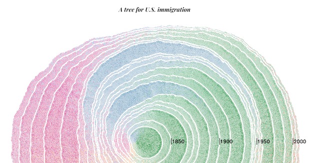
One of the best visualisation project concepts and executions I’ve ever encountered, this work by Pedro Cruz, John Wihbey, Avni Ghael, and Felipe Shibuya portrays temporal-geospatial patterns of immigration into the United States in such a brilliantly clever, elegant, efficient, informative and beautiful way.
2. ‘Human Terrain’
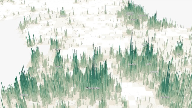
A genuinely captivating project from Matt Daniels of ThePudding, ‘Human Terrain’ is a staggeringly detailed, explorable prism map of the world’s population that can trap you into browsing for far longer than you can realistically afford. It evokes memories of a classic graphic from 2006, created by Joe Lertola for Time magazine. There is also a wonderful companion piece, ‘Population Mountains’, where Matt walks through ‘a story about how to perceive the population of cities’.
3. ‘Vox Kavanaugh vs. Ford’
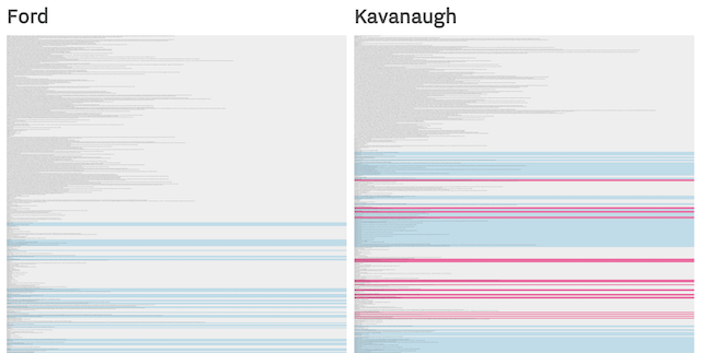
A typically astute piece by one of my favourite visualisers, Alvin Chang, where he creates a visual transcription of the Senate testimony of Supreme Court nominee Brett Kavanaugh and the woman accusing him of sexual assault, Christine Blasey Ford. This visual plots the occasions where Ford and Kavanaugh answered the questions put to them as well as the occasions when they did not. The result is striking and it was compelling to witness the ripple effect of this piece being cascaded across social media.
4. ‘Frames of mind’
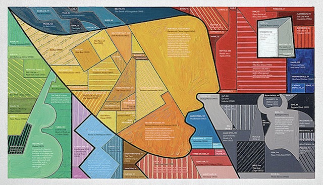
Technically speaking, this was published in the first half of 2018 but I only came across this outstanding demonstration of the talent and craftmanship of Alberto Lucas López, Senior Graphics Editor at National Geographic, during the second half of 2018. In this work, Alberto analyses and visualises the work of Pablo Picasso using Picasso’s own technique: the resulting work is a handmade oil on canvas tree map visualization dividing up proportionally the works of art belonging to each of the major 12 themes of his career.
5. ‘Byrne’s Euclid’
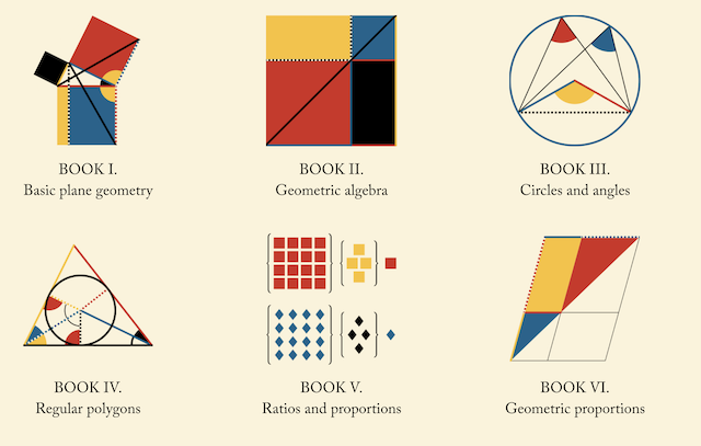
Another piece that boggles-the-mind in its scale, detail and demonstration of the talent of Nicholas Rougeux, who has reproduced “Byrne’s Euclid”, originally created by Oliver Byrne in 1847, creating a vast body of intricate interactive diagrams across six books and painstakingly compiled posters as a ‘tribute to the beautiful original design’. The accompanying ‘making of’ post alone would warrant inclusion on this list.
6. Reuters Graphics
The visualisation and infographic work coming from the Reuters Graphics team has, for a long time now, been of the highest quality but, with an ever-growing team packed full of fresh talent, it feels like the volume of work is increasing accordingly, which is great to see. The team were responsible for two of my favourite pieces last year: firstly this article investigating Australia’s drought (with some brilliant use of photoimagery) and then this detailed examination of what has changed or not in the 10 years since the 2008 financial crisis, which superbly integrates video, audio, visuals, narrative, and interactivity.
7. Multiple Views
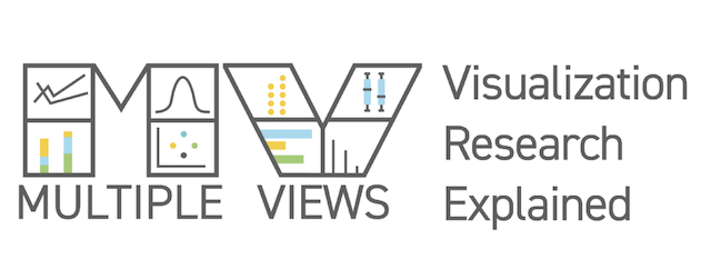
An important new blog co-edited by Jessica Hullman, Danielle Szafir, Robert Kosara, and Enrico Bertini which is all about offering a central, collated place to publish and learn about the latest data visualisation research. It is already growing into a crucial, accessible resource for anyone to learn about visualisation research developments as authored “by the people who do it”.
8. The data visualisations of W. E. B. Du Bois
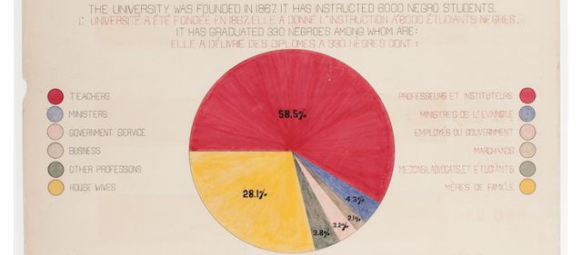
Jason Forrest has authored an amazing 6-part series exploring the pioneering visualisation work of activist and sociologist W. E. B. Du Bois. I have to concede I had only become aware of Du Bois’ name and work in this field probably over the past year so it was an education to read through Jason’s outstanding research. Adding more profile and celebration of this important figure in the ancestry of this field, Whitney Battle-Baptiste and Britt Rusert have edited an excellent looking book “W. E. B. Du Bois’s Data Portraits: Visualizing Black America”, which was published towards the end of 2018.
9. Discourse in response to the NYT’s “extremely detailed map of the 2016 election”
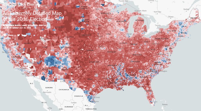
Each year it seems there is a standout debate between key people at the top of this field. For 2018, it feels like the most stirring debate centered around the New York Times’ interactive choropleth map which allowed you to explore the 2016 presidential election at the highest level of detail available, voting precinct. The map was released alongside an article which walked through some specific headline insights around the ‘political bubbles’ that were revealed by this detailed mapping exericse. Whilst the map reached a wide audience it caused some consternation amongst mapmakers/cartographers, like Ken Field and Jon Schleuss, who shared concerns that this map failed to factor in voter density (thus making the country as a whole seem extremely republican red). To counter this, Josh Katz, one of the map’s creators, offered a considered response to explain why population density was not depicted as it would undermine seeing “the political character of a place” and that’s what they were interested in showing (more so than zooming out to see the ‘colour of the country’ as a whole). This is supported by the patterns exposed in the political bubbles article. The challenges of mapping has previously been discussed by the New York Times’ Alicia Parlapiano following a similar debate that erupted after they published in print a detailed map of the 2012 Election results at zip code level prior to the 2016 Election. Andrew Middleton offered a further reflection about these challenges and also about the debate, landing on the central issue here: “No one map can do the job”. Phillip Bump also explored the tensions in plotting population based phenomena across geographic areas (though not directly addressing the NYT piece).
10. Opening up the data behind journalism
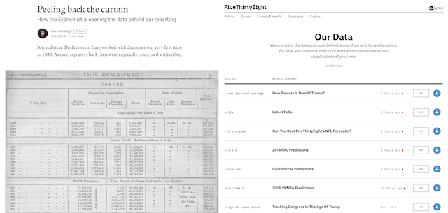
In what could prove to be a growing trend in 2019, The Economist and FiveThirtyEight launched new repositories for publishing releases of the data behind their work. As Evan Hensleigh explains “…releasing data can give our readers extra confidence in our work, and allows researchers and other journalists to check — and to build upon — our work”. Furthermore, where appropriate, both are intending to release the associated analysis and code behind each data-driven article/graphics projects.
Special mentions…
Here are the other highlights from the second half of 2018 that deserve a special mention:
Data Feminism | This is the (now closed) review site for all the chapters that will make up the upcoming book “Data Feminism” by Catherine D’Ignazio and Lauren Klein set to be published by MIT Press during 2019
Charticulator | This tool launched just after I published my last 6-monthly roundup in which I profiled the emergence of tools like Data Illustrator and Flourish. Charticulator is from Microsoft offering ‘interactive construction of bespoke chart layouts’
‘Coral Cities’ | Lovely project from Craig Taylor, based on the concept of ‘making city networks look like living corals’
‘Seven endangered species that could (almost) fit in a single train carriage’ | Smart work, as always, from Mona Chalabi who finds a powerful way to depict the decline in numbers of certain species using the container of a NY subway carriage
CNN’s Mid-Terms graphics | Of all the excellent work produced by the media for the US Mid-Terms, I found some of the most novel techniques were exhibited on the CNN politics website (eg. this sketchy design by Mathew Conlen)
The Economist’s ‘transatlantic flights’ chart | A really innovative way of showing changes in flight ticket prices vs. distances
‘How many years do we lose to the air we breathe?’ | Detailed exploration by the Washington Post with a terrific interactive marimekko chart and the first use (I know of) of the Equal Earth map projection.
‘Here’s How America Uses Its Land’ | Super nice work by Dave Merrill and Lauren Leatherby of Bloomberg – smart visuals, interesting analysis, and a slick overall experience