Infographic : BBA vs MBA Infographic
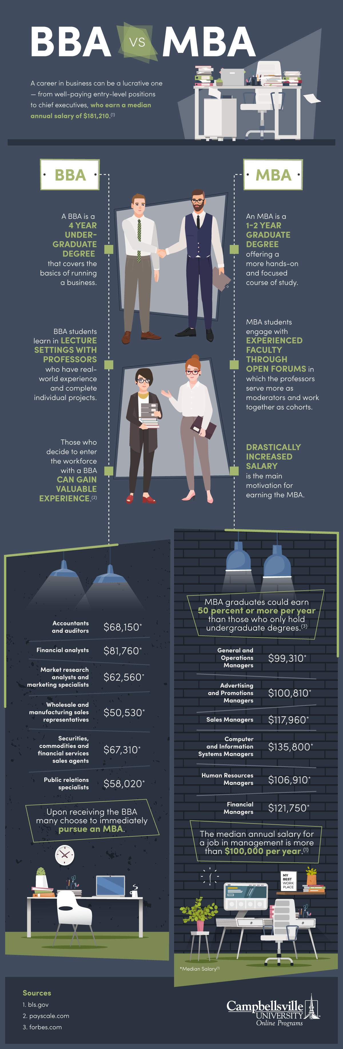
A Master of Business Administration (MBA) is a two-year degree course focused on managing a business.
A Bachelor of Administration (BBA) is a four-year post grad course focused on the basics on running a business.
I’ve always been an advocate for gaining experience through ‘doing’ and not just reading and studying.
In cases such as being a doctor or a lawyer then, yes, you do need to study but for many professions, I think you learn far more by getting stuck in and doing yourself.
I can hear many screams of opposition to this theory but if I was hiring I would judge a candidates aptitude first before anything else because you can teach any skill but you can’t teach attitude.
To fly in the face of my jump-in-swim-fast attitude to life research does show that MBA graduates can earn up to 50% more in salary than their undergraduate peers.
And, I guess that is the pull for having an MBA on your CV.
Campbellsville University has compiled an infographic entitled: BBA vs MBA in a bid to shed light on the quandary of how much money to invest in your studies vs how much payback you can achieve in your working life.
The median annual salary of a chief exec is $181,210. So, I guess it’s a simple equation.
Design overall – 7.5
The design is well presented and displays all information clearly and efficiently.
Typography – 6.5
All information is clear to read and type hierarchy is well organised.
Illustration – 7.5
The graphic has a strong illustrative banner which well represents the subject and the infographic carries the illustration theme through the piece to offer a pleasing visual.
Content – 7
The content is clearly directed at those in the position of making a decision between completing a BBA and going straight into the workplace or those topping up with an MBA for enhanced career success.
Overall score – 7/10
A well-presented infographic targeted to offer a strong answer a niche question.