Infographic : Best of the visualisation web… April 2019
At the end of each month I pull together a collection of links to some of the most relevant, interesting or thought-provoking web content I’ve come across during the previous month. Here’s the latest collection from April 2019.
Visualisations & Infographics
Covering latest visualisation, infographic or other related design works.
Visual Cinnamon | ‘Adyen’s Shareholder Report’
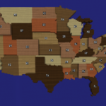
The Economist | ‘American inequality reflects gross incomes as much as taxes’
JetPack | ‘Brussels. A lovely Melting-Pot’
@amycesal | ‘When you’re marrying the human you met while collaborating on #dataviz together, you’re basically required to collaborate on some viz for the wedding, right?’
The Pudding | ‘Why Budapest, Warsaw, and Lithuania split themselves in two’
Washington Post | ‘An illustrated guide
to all 6,887 deaths in Game of Thrones’
Reddit | ‘Angle of sun and daylight as year progresses showing day, night, poles and whole world [OC]’
@AlexCEngler | ‘And so begins the annual thread of projects from my #dataviz class: If you like graphs that matter, this is the place for you. ‘
@chartball | ‘How Charlotte beat Toronto, Friday, Apr 5th 2019 #gamecharts’
New York Times | ‘Easter Sunday Attacks Add a New Dimension to Sri Lanka’s Sectarian Tensions’
@chartball | …and related, ‘As these NBA game charts build, they leave behind a useful little slope chart that shows how the game played out. Working now on using those to show a team’s entire season history…’
The Pudding | ‘Colorism in High Fashion’
New York Times | ‘The ‘Dumb Choice’ That James Harden,
Stephen Curry and the Rest of the N.B.A. Increasingly Avoid: The 2-Point Shot’
Fathom | ‘Understanding the Mueller report through word association’
Financial Times | ‘FT Data Crunch: “Numbers behind the news” – FT statistics journalist Federica Cocco and data journalist John Burn-Murdoch investigate the numbers behind the news’
Volkskrant | ‘The YouTube stars of the reactionary right’ [Translated from Dutch]
Small Multiples | ‘How to plan a holiday using data’
Siemens | ‘The atlas of digitalization’
Boring Bar Chart | ‘They gave colour to our history’
SRF | ‘The income is distributed so unequally in Switzerland’ [Translated from Swiss]
Axios | ‘Israeli moon landing to mark milestone in lunar exploration’
@leenkededonder | ‘I made a visual exploration tool to analyse the wrappers of chocolate easter eggs. One egg = one egg. A first step towards a universal legend for wrappers’
The Guardian | ‘Mapped: historical public transit systems v their modern equivalents’
The Economist | ‘MPs’ Brexit votes reveal myriad divisions among the Tories’
Washington Post | ‘The issues 2020 Democrats are running on, according to their social media’
Washington Post | ‘Mapping America’s wicked weather and deadly natural disasters’
BMJ | ‘Primary care management of chest pain after coronary artery bypass surgery’
The Guardian | ‘Spain’s general election 2019: all you need to know’
The Upshot | ‘Spanish Grand Prix 2019: 60-Second Animated Recap’
New York Times | ‘Stephen Curry has a Popcorn Problem’
Why do cats and dogs…? | ‘You know, cats and dogs can be utterly strange sometimes…’
Scientific American | ‘To Prevent Women from Dying in Childbirth, First Stop Blaming Them’
@worville | ‘Quick thread on a few more of these age vs. mins plots’
@tjukanov | ‘Visualizing Finnish elections [thread]’
New York Times | ‘Why Notre-Dame Was a Tinderbox’
Articles
These are references to written articles, discourse or interviews about visualisation.
Sandra Rendgen | ‘Input: What is a Dashboard?’
Datawrapper | ‘Two charts in one’
Data Journalism | ‘Putting data back into context’
Medium | ‘Fine. is an investigation of how emotion visualization could look like and work. It is the web-abbreviated master’s thesis from Anna Wiederkehr, published in spring of 2017’
@srendgen | ‘…a brief summary of all talks at #malofiej27 in Pamplona last week, incl. slides and live Twitter threads’
Visual Cinnamon | ‘Techniques for Data Visualization on both Mobile & Desktop’
Learning & Development
These links cover presentations, tutorials, podcasts, academic papers, case-studies, how-tos etc.
Esri | ‘I’m excited to introduce dot density as the latest visualization tool available’
Ken Flerlage | ‘More Sankey Templates: Multi-Level, Traceable, Gradient, and More!!’
Visual Cinnamon | ‘The Design Process of “Why Do Cats & Dogs …?”’
Subject News
Includes announcements within the field, such as new sites or resources, new book titles and other notable developments.
Information is Beautiful | A huge collection of datasets that have shaped lots and lots of graphics by David McCandless/Information is Beautiful team
SITE | ‘Data Visualization: A History of Visual Thinking and Graphic Comminication’ – the upcoming title of a new book with Michael Friendly and Howard Wainer as co-authors
Publications office of the EU | Announcing EU DataViz 2019, an international conference taking place on 12 November 2019 in Luxembourg, organised by the Publications Office of the European Union
Missing Numbers | ‘Introducing Missing Numbers: a blog on the data the government should collect, but doesn’t’
Sundries
Any other items that may or may not be directly linked to data visualisation but might have a data, technology or visual theme.
It’s Nice That | ‘Ellen Evans’ latest film zooms into the tiny world of miniaturism’
TED | ‘How to take a picture of a black hole’
Atelier des Lumieres | ‘Van Gogh, Starry Night
Created by Gianfranco Iannuzzi – Renato Gatto – Massimiliano Siccardi – with the musical collaboration of Luca Longobardi’