Infographic : DVS: What makes a data visualisation elegant?
Across this next two weeks, I’m very happy to be playing the role of host moderator for one of the Data Visualization Society slack channels – topics-in-data-viz – curating a discussion about a hot-topic in data visualisation.
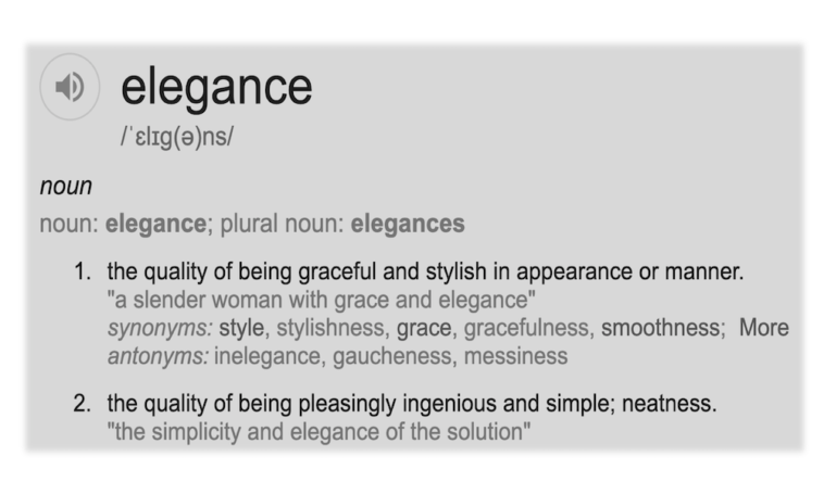
The topic I have chosen concerns a matter that I always find a difficult one to pin down, to characterise and to articulate to others: What makes a data visualisation elegant? If you’re a member of DVS slack, jump on over there now to join in the discussion!
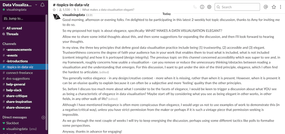
Once the two week period has elapsed I will write up a summary of the main observations and discussions raised on the DVS’s medium platform: Nightingale.