Infographic : Explore Explain S1 E8: Rachael Dottle
I’m delighted to launch the first season of Explore Explain, a video and podcast series about data visualisation design.
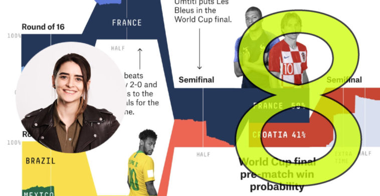
For episode six it was a pleasure to welcome Rachael Dottle. We had a detailed conversation about the design story behind a visualisation she created during the 2018 World Cup for FiveThirtyEight, titled ‘How France And Croatia Made It To The World Cup Final, In One Chart’.
To find out more information about how to listen, view and subscribe to the audio and video versions of this episode, and to view the full list episodes, visit the podcast page.
Video Conversation
You can watch this episode on the dedicated Explore Explain Youtube channel or through using the embedded player below.
Audio Conversation
The audio podcast is published across all common platforms (such as Apple, Acast, Spotify etc.), which means you will find this series listed in the respective directories through a simple search for ‘Explore Explain’.
You can directly reach the podcast on ANY platform by manually adding this url – https://feed.pod.co/exploreexplain – or by clicking this link if you’re reading this on a phone browser.
Here are further links to some of the key resources mentioned during this episode: