Infographic : Exploring Job Ads Bias Infographic
The Gender Pay Gap has had a big impact on industry over the last few years as the UK begins to wake up to inequality between genders. For years women have had to suffer from lesser pay for the same role and for being discriminated against when applying for jobs.
Attitudes are now beginning to change and significant shifts are being seen.
In response a new ruling for Advertising Codes states that ads must no longer depict harmful gender stereotypes. This comes into effect on 14 June 2019.
For example, an advert will no longer be able to show a woman being solely responsible for housework whilst a man relaxes and expects her to tend to him. Or, will a women be represented as being solely responsible for childcare in a couple.
it will be interesting to see what impact the changes in advertising will begin to have on the mindset of the general population. After all, advertising is such a powerful medium.
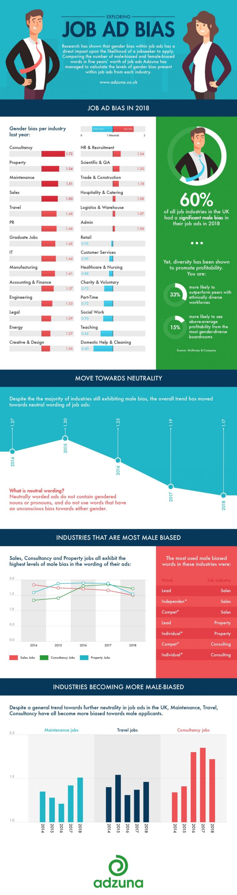
Adzuna conducted their own study into job advertising to see if there was a predominant gender bias. The answer was yes. 60% of UK industries have a bias towards male applicants and they used 17% more masculine associated language in their job advertising than feminine language.
The worst offenders were consulting, sales and property.
The full survey by Adzuna was visualised by DesignbySoap as Exploring Job Ads Bias Infographic.
Design overall – 7
A crisp and well presented design that clearly reflects the subject. Each section is clearly divided and uses strong colour blocks to good effect. All graphs and data are clearly presented and easy to read and understand.
Typography – 7
All type hierarchy is strong and clear.
Illustration – 8
The main banner employs graphic illustration to represent the male and female gender as equals wearing similar clothing.
Content – 9
The unique research is strong data to offer to their audience and using an infographic to present the graphs works very well in this instance.
