Infographic : Five ways to… title your work
In this series I am looking at different contextual, editorial, analytical, or design challenges encountered when working on data visualisation tasks. Each will be framed around a specific ‘everyday’ challenge with five possible methods, ideas or observations presented. Focusing on just five is deliberately arbitrary and non-exhaustive: just enough to provide some different ideas but not enough to pretend to be definitive.
What are five different ways for titling your work?
Any data visualisation used for communicating understanding to others will need to have some element of a title. That may be a project title at the front of a report, at the top of a graphic or web page, or simply above a chart. We often resort, by default, to using the title to describe to the reader what analysis has been conducted eg. “Total staff numbers broken down by department, July 2019”. Such an approach is often entirely suitable given the contextual circumstances of a given task. However, though this is of course useful information to share *somewhere*, I often find this approach to be somewhat mechanical and misses an opportunity to communicate something more using this unique piece of apparatus. After all, a title is usually amongst the most prominently displayed and immediately seen features of any work, regardless of format.
The five suggestions below offer some alternative ways to think about using this prominent piece of real estate. When you need to or can do something more with a title than just describe what’s plotted, these approaches may help to better inform or charm your audience into engaging with your work.
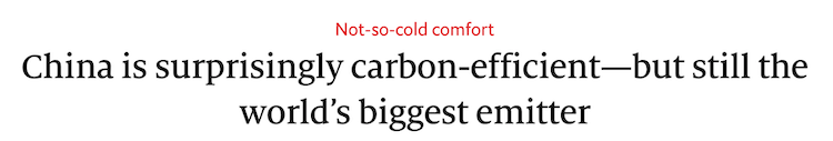
1. The ‘Statement’ title
This type of title approach takes the responsibility to say something. Depending on what the main insights are from the work, you might use this title space to reveal a key finding, a core conclusion or a summary observation from the visuals that follow. Read more about how this approach has now been adopted, where relevant, by the ONS.
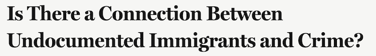
2. The ‘Question’ title
Questions are the fuel behind any good and worthwhile visualisation. A good way to align your audiences expectations and interests in your work is to present the core curiosity your work has pursued, in question form, with the visuals that follow aiming to support the answering of that curiosity.
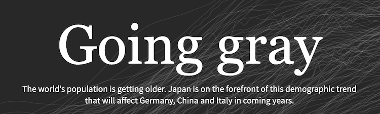
3. The ‘Artistic’ title
‘Artistic’ in this context means a short and punchy, but perhaps somewhat enigmatic, main title, a style you might find associated with a work of art, but often necessarily supplemented with a subtitle offering a more descriptive project background.
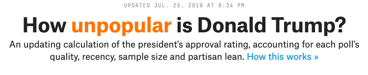
4. The ‘Dynamic’ title
With web-based visualisations, there is scope to become more creative with your titling, perhaps adding some level of interaction to allow the user to customise it or, as in the example below, when you can’t decide whether to focus on the glass being half-full or half-empty, do both.
5. The ‘Visual’ title
When the content of your title is something that is explicitly data-based, there are some further creative approaches that integrate titles with chart displays, either overlaid with a background device, like the example below, or through the inclusion of micro charts within the title sentence structure (like sparklines).