Infographic : The little of visualisation design: Part 68
This is part of a series of posts about the ‘little of visualisation design’, respecting the small decisions that make a big difference towards the good and bad of this discipline. In each post I’m going to focus on just one small matter – a singular good or bad design choice – as demonstrated by a sample project. Each project may have many effective and ineffective aspects, but I’m just commenting on one.
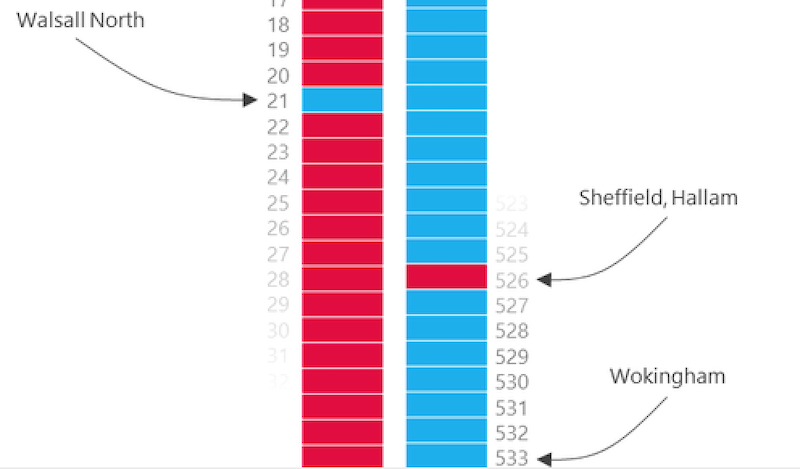
The ‘little’ of this next design concerns the gradual fading of labels. The visualisation of interest was produced by Alasdair Rae in his exploration of deprivation across UK political constituencies.
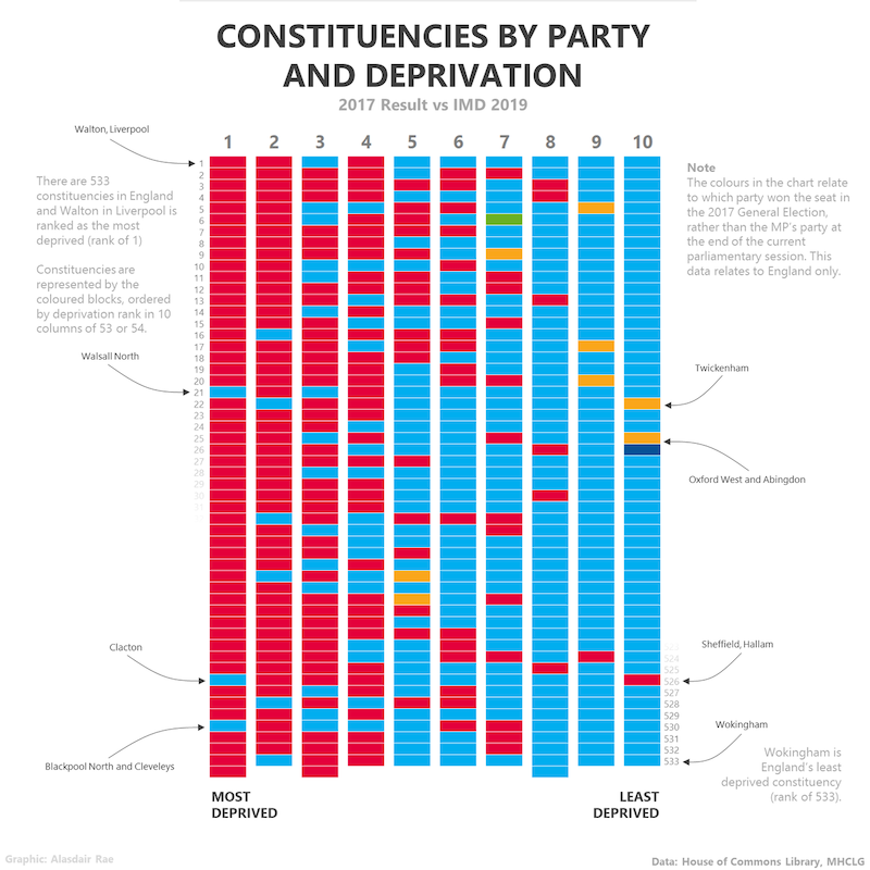
The little design choice I like here is how Alasdair provides labels for the first few and final few ranking positions, to the top left and bottom right of the chart, but then fades them out once the idea of this sequencing has clearly been established.
There is no need to directly label the ranking position of every cell, rather it is the general relative position that is important – is a constituency more deprived, so on the left side of the chart, or less deprived, on the right hand side. Rather than just have an abrupt finishing of the labels, the fading effect offers a nice exit.