Infographic : The little of visualisation design: Part 69
This is part of a series of posts about the ‘little of visualisation design’, respecting the small decisions that make a big difference towards the good and bad of this discipline. In each post I’m going to focus on just one small matter – a singular good or bad design choice – as demonstrated by a sample project. Each project may have many effective and ineffective aspects, but I’m just commenting on one.
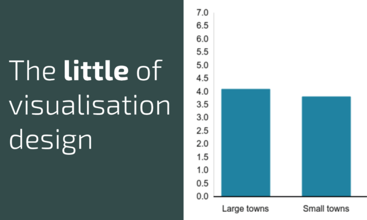
The ‘little’ of this next design concerns the redundancy of axis scales. The chart in question was published on a BBC article titled ‘General election 2019: Why North-South is not England’s only divide’. The issue with this chart is the unnecessary inclusion of so many y-axis labels.
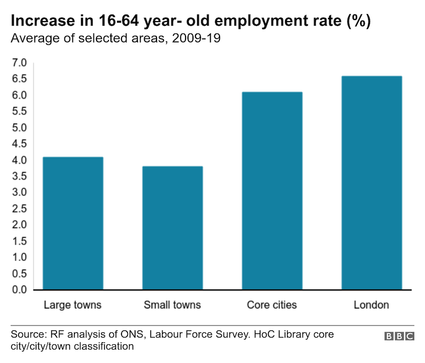
Axis scales are useful to include when you are assisting the reader in trying to judge the size of values represented by the bar heights. In this case however, there are only four bars. It would make more sense to directly label the bars with their actual values rather than include 15 y-axis scales at 0.5% intervals. Perhaps as a rule of thumb, if you have more axis labels than items in your chart you should switch the labelling around.