Infographic : The little of visualisation design: Part 71
This is part of a series of posts about the ‘little of visualisation design’, respecting the small decisions that make a big difference towards the good and bad of this discipline. In each post I’m going to focus on just one small matter – a singular good or bad design choice – as demonstrated by a sample project. Each project may have many effective and ineffective aspects, but I’m just commenting on one.
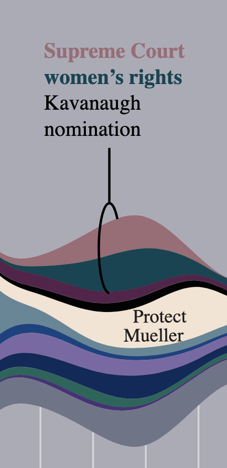
The ‘little’ of this next design concerns a neat way to design a label pointer from this work by Alyssa Flowers titled ‘Points of Light: Protest in America’ which explores patterns around the more-than twenty thousand protests that have been held in America since the inauguration of Trump.
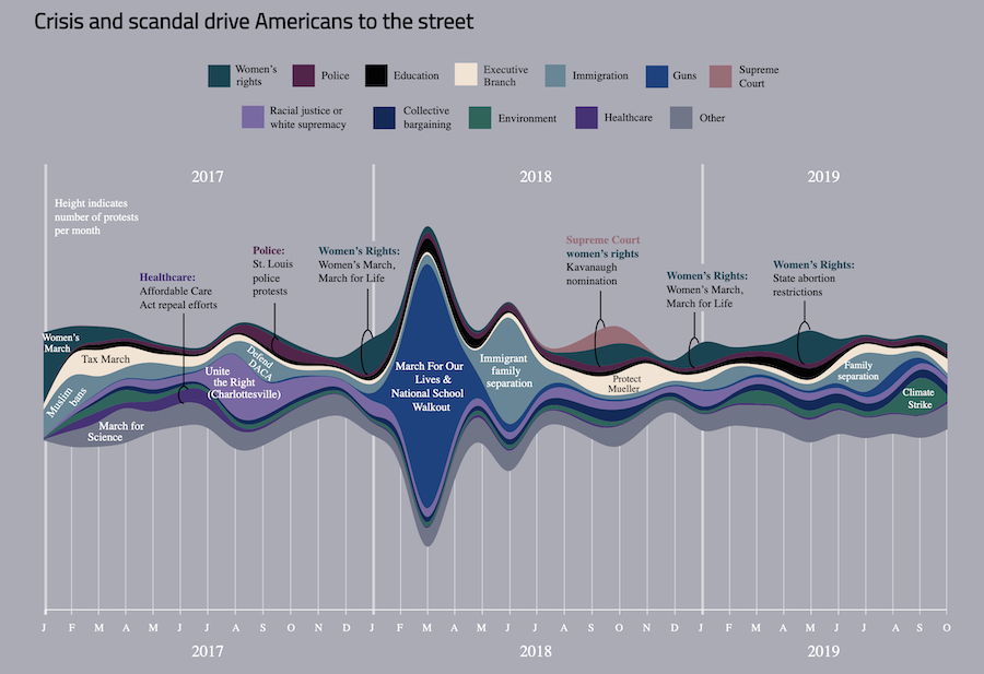
The little detail I wanted to pick out in this piece is the elegant style of pointer used in the stream graph found half way down the page. I love a nicely presented arrow but here we have a whole new concept, the lasso-rope pointer! It works really well to draw your attention to the parts of the chart being referred to and is a particularly smart choice in this case as it allows you to loop in multiple layers together, as you see below, which would normally require multiple arrow lines.