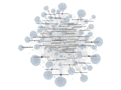
Infographic : visualcomplexity.com | Guardian’s Facebook Page
Using graph visualization software Gephi, Bernhard Rieder mapped the various interactions on the Facebook page of the Guardian by extracting all the likes and comments for the last 80 posts. On the whole, there were 9.500 users liking and commenting away. Each dark and labeled node is a post while all the others are users. A heat scale (blue => yellow => red) shows how often a user interacts with the page; size shows how often a node was liked or commented on (for pages) or liked and commented (for users).
One can see a a core of regulars in the middle of the graph, but the main engagement comes from a large majority of users that have only interacted with a single posts. These users drag the big subjects out to the margins in this specific spatialization. Engagement, here, comes from a fleeting audience rather than a more stable group or community.