Map Info & Chart : A portrayal of the severity of Australian fires
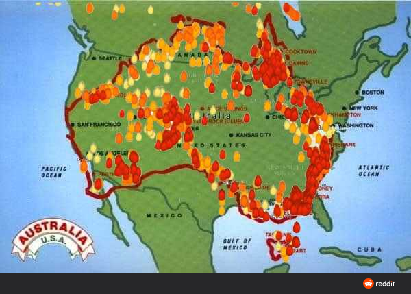
A portrayal of the severity of Australian fires
By WallStreetCrash1929
At infographic.tv we provide handpicked collection of the best infographics and data charts from around the world.