in

Map : Europe mapped by tweets. Each colour represents a language.

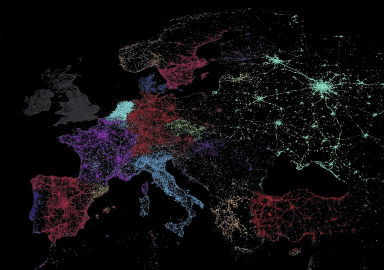
Map Info & Chart : Europe mapped by tweets. Each colour represents a language.

Europe mapped by tweets. Each colour represents a language.

By zeku94

At infographic.tv we provide handpicked collection of the best infographics and data charts from around the world.

  • Sharing is caring !
  • What do you think?

    459 points
    Upvote Downvote

    Leave a Reply

    Your email address will not be published. Required fields are marked *

    Loading…

    Video Infographic : Memorize Anything In 60 Seconds (Quick Tips and Tricks To Remember Things)

    Map : how texas is really by a texan