in

Map : How the Mercator Projection Distorts the True Sizes of Countries on Maps (by neil kaye)

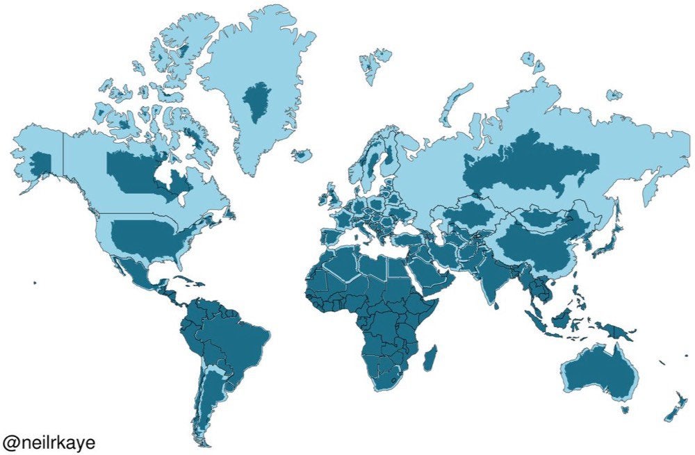
Map Info & Chart : How the Mercator Projection Distorts the True Sizes of Countries on Maps (by neil kaye)

How the Mercator Projection Distorts the True Sizes of Countries on Maps (by neil kaye)

By 1324jam

At infographic.tv we provide handpicked collection of the best infographics and data charts from around the world.

  • Sharing is caring !
  • What do you think?

    459 points
    Upvote Downvote

    Leave a Reply

    Your email address will not be published. Required fields are marked *

    Loading…

    Graph : 10 Tips To Sell Your House Fast In Utah [INFOGRAPHIC]When…

    Graph : These infographics detail the increasing environmental threats…