Map Info & Chart : Increase in GDP (PPP) per Capita in current international $ – From 2000 to 2017
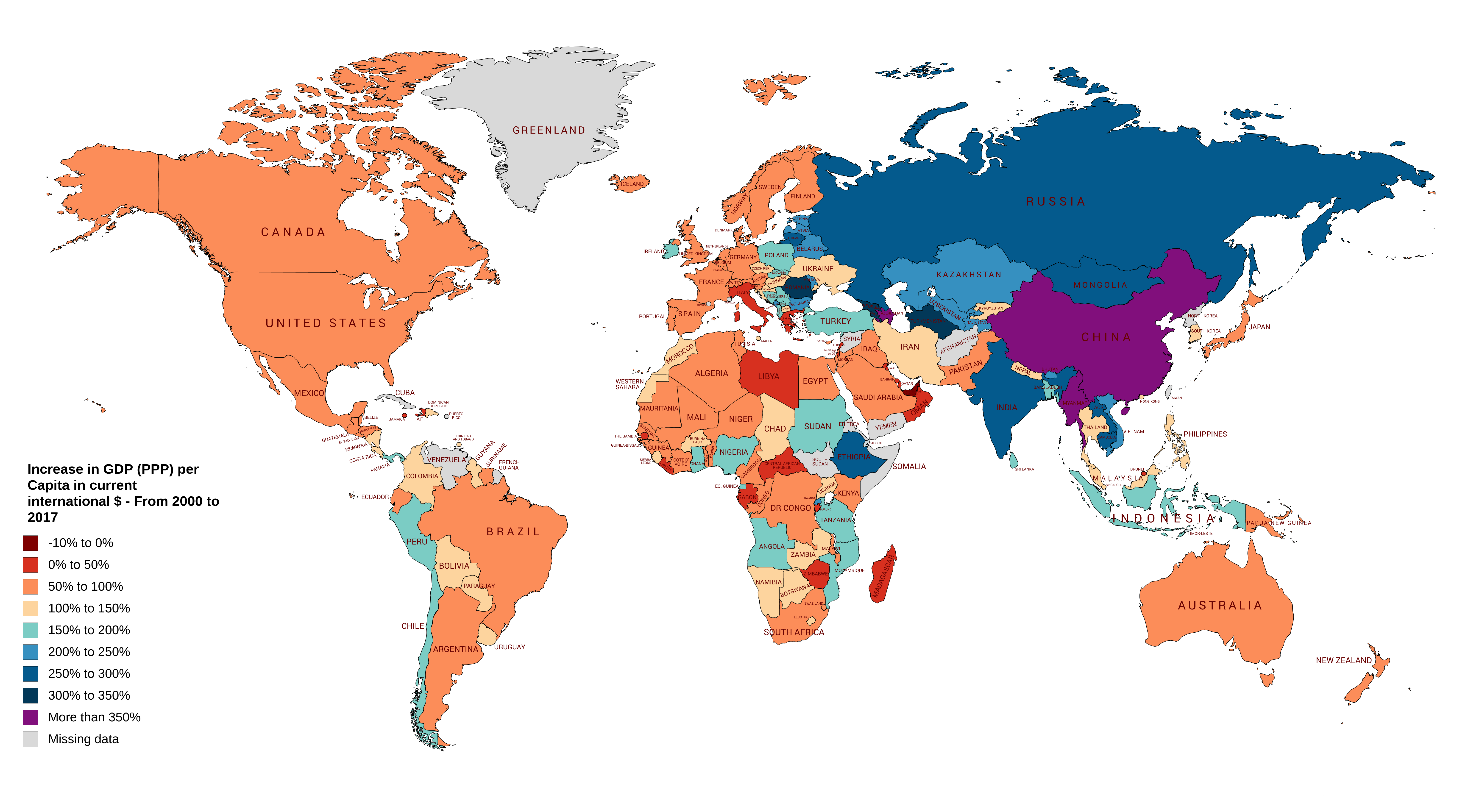
Increase in GDP (PPP) per Capita in current international $ – From 2000 to 2017
By ollowain86
At infographic.tv we provide handpicked collection of the best infographics and data charts from around the world.