
Map Info & Chart : Life expectancy at birth, female (years)
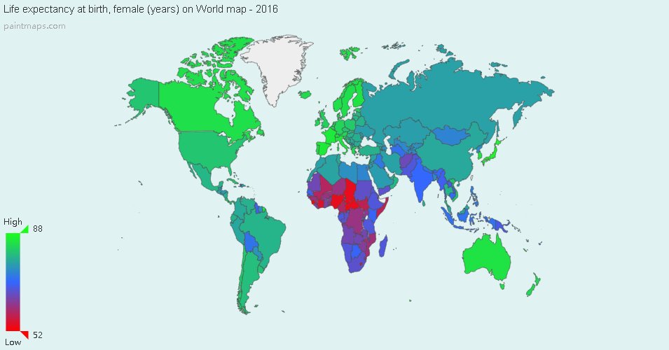
Life expectancy at birth, female (years)
By ytkn55
At infographic.tv we provide handpicked collection of the best infographics and data charts from around the world.

Here you'll find all collections you've created before.