Map Info & Chart : Making of Bengaluru Tourist Map

​
[Small Sample of Bangalore Tourist Map (Low Res)](https://preview.redd.it/3e1oz8yismu31.jpg?width=1568&format=pjpg&auto=webp&s=045ce52378f6ff9801fac566dc1219acf4bc4707)
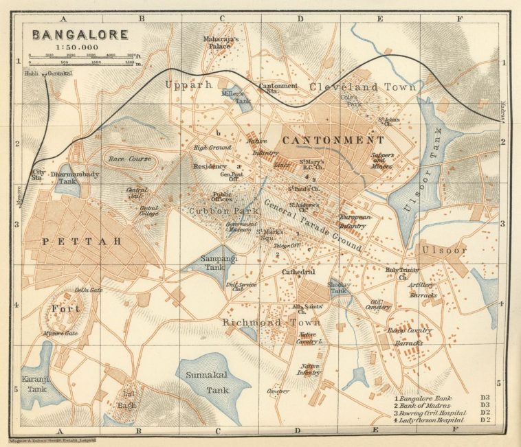
Bangalore or Bengaluru, the city which got itself a pretty name from boiled beans, yes, the legend says so and the word Bengaluru literally translates into “the city of boiled beans”. It is such a beautiful city but I can hardly find any comprehensive map on the net which somehow highlights all that this city has to offer to a tourist. The Google search for Bangalore map gets links to drab amateurish maps and the best map that you find is probably [available here](https://i.pinimg.com/originals/cf/a2/ae/cfa2aeb85ab585f3c58a90cdd5d0b8f1.jpg) and interestingly this map is of the 1900s. I tried searching with different terms and landed on various maps like [this detailed tourist map](http://www.orangesmile.com/common/img_city_maps/bangalore-map-0.jpg) or this one, [a very small tourist map](https://www.mapsofindia.com/bangalore/travel-to-bangalore.html#touristmap). Bengaluru, the most vibrant city of India, home to the 20th century industry, the Information technology and iconic Infosys and Wipro but sadly the best cartographic map of this city is of the 1900s. Probably that is not just the case with Bengaluru but almost all the cities of India, we hardly have any good maps [like those of US cities](https://www.google.com/search?biw=1366&bih=637&tbm=isch&sxsrf=ACYBGNQil3albI1Yptbo3JiLgAKTZJmL_g%3A1571668514863&sa=1&ei=IsKtXc6cNJ7Bz7sPnJKVkAs&q=great+NYC+maps&oq=great+NYC+maps&gs_l=img.3…132617.133253..134494…0.0..0.102.465.4j1……0….1..gws-wiz-img…….0i8i7i30.frPKhXiosVM&ved=0ahUKEwjOtaG8ya3lAhWe4HMBHRxJBbIQ4dUDCAc&uact=5).
### Open Source GIS Data and Mapping
After hanging my boots, I have been freelancing as a GIS professional, a cartographer, crunching open domain data, teaching thematic mapping and making diverse maps of the World but somehow could not get down to making one of Namma Bengaluru. And in a way I really owe my after Army career to this beautiful city, where in true sense I was introduced to the art and science of open data cartography almost a decade back. Yes, way back in 2004 when I was posted with a mapping unit digitizing the Survey of India hard copy maps and one day find that we had very few maps left for digitization. Just for the uninitiated, digitization is the term used for converting hard copy maps into digital, computer ready vector maps.
Anyway, we were short of hard copy maps to digitize and an urgent need to find ways and means to somehow keep the manpower gainfully employed. After a bit of brainstorming, we decided to make maps of unmapped areas especially across the border in the Northern and North East regions of India. It was then that I researched making maps with [ETM+ imagery](https://www.usgs.gov/centers/eros/science/usgs-eros-archive-landsat-archives-landsat-7-enhanced-thematic-mapper-plus-etm?qt-science_center_objects=0#qt-science_center_objects), [GeoNames](https://www.geonames.org/) and [SRTM elevation data](http://srtm.csi.cgiar.org/). So from these three open domain sources many of our maps especially those in Myanmar, China, Nepal, Bhutan and even in POK were made.
Back then [OpenStreetMaps.org](https://www.openstreetmap.org/) (OSM) was still in its infancy and even Google maps had very little data of India. However just about a decade plus later, the open domain, especially the OSM has almost one GB data for Bangalore itself. Yes, I downloaded Bangalore data from [OSMaxx](https://osmaxx.hsr.ch/) which allows bulk downloads and the zip file was around 800 MB.
**The Open Domain Data Deluge**
About a decade back, there was very little open domain data of Bangalore and that’s why making a map was tough and today there is so much of data that making a map is again so tough. There were more than two dozen shape files in the bulk download and more than 125 feature classes, right from ATM to wayside_shrine in the POIs (Points of Interest) file itself. The roads were of 25 types from Bridleway to Trunk and the data contained more than 3000 individual tree locations too and some of them had funny names too, like planted by Mr. Thakur. Similarly the data about the buildings was gargantuan with 500MB shp file and more than half a million individual buildings in it. The building file was so huge that it just would not get ingested into Adobe Illustrator with my favourite GIS plug-in the [Avenza MAPublisher](https://www.avenza.com/mapublisher/), crashing it every time. The fault probably lies in Adobe memory management in Windows based systems wherein large files do have the habit of crashing Illustrator.
**The Data Quality Issues**
On examining the data, it is not just the volume but the quality which can be a little suspect with lots of errors especially in feature class spellings like aprtment, apartments and apartment which would make three feature classes representing one entity. The sad part is that such errors are appreciably more in the Indian data of OSM probably because we never had any official open data like the [TIGERLINE](https://www.census.gov/geographies/mapping-files.html) data of US or the [Ordnance data](https://www.ordnancesurvey.co.uk/opendatadownload/products.html) of UK. All these errors make it much tougher to utilize open domain data in making quality maps, especially of non-US areas and probably gave me an excuse not to make an attempt on Bangalore map despite not finding any good quality map of Bangalore on the net.
**Finally, The Excuse to Make the Namma Bengaluru Map**
Ultimately I found an excuse to make the Bangalore map when I stumbled across a story in the newspaper that Bangalore International Airport Limited (BIAL) had announced a [map contest](http://www.newindianexpress.com/cities/bengaluru/2019/sep/13/bial-to-hold-map-design-contest-2032984.html). The contest was announced in almost all the newspapers and must have received a wide publicity, so the chances of winning would be slim but even then it kind of justified the time I envisaged that it would take to organize the data and make a presentable map. And sure it took a lot of time especially setting up the data, sifting out the unessential, thinning it out, joining the small road segments for running the [MAPublisher LabelPro](https://www.avenza.com/purchase/mapublisher-labelpro-add-on-floating-license/). The open domain data has lot of pitfalls and needs lot of geo-processing prior to making a cartographic product.
**Thinning Out the Data**
The one gig of data which I downloaded from the open domain was not only unwieldy for Illustrator but had lot of errors too. So I had to thin out the data. Sadly I could not find any methods in MAPublisher to do the thinning out as it was not able to load the data and display it. I am sure there would be some tricks in MAPublisher to deal with such issues. Now I know from my experience in GIS cartography that one software can’t handle all aspects of making a map. So I used another open domain software, [QGIS (Quantum GIS)](https://qgis.org/en/site/) which is an absolutely amazing open domain GIS work horse. It sure can’t match the capabilities of [ESRI ArcGIS](https://www.esri.com/en-us/home), however QGIS has all the geo-processing tools to manipulate the data for making cartographic products.
**The Rationale Behind the Thinning Out**
The thinning out also has to have some rationale, one can not just delete the data at random. So the methodology of deletion I could decide after a bit of analysis of the OSM data layers. For example the OSM data had two POI (point of interest) layers, one was a point geometry layer and the other was an area geometry layer. Although the point POI layer had almost 20,000 POIs whereas the area POI layer had just about 4,000 but there were lot many which were common. So I joined the two layers having the same name but even then I had more than 2,000 POIs which are one too many to display on a map. The basic cartographic generalization principle of area was the next to thin out the data further. So I used the area property to get the area of the POIs from the POI_a.shp layer and weeded out very small areas to get a manageable 200 odd POIs and you will find that I have listed 99 of the important ones in the Index of the map. I did similar exercise for the gardens, parks, water bodies and even hospitals too. The GIS data provides you with lot of options to thin out the data for making cartographic products, the only question is how you do it to achieve the results.
Similarly, road layer also had roads down to footpath and displaying all these geometries would have cluttered the map, so I weeded out the bridleways, footpaths, steps and so on from the data. Though some of the footpaths are essential in large parks and forest areas like Lalbagh, Cubbon park etc. So I used the clip function to clip out small roads in large green areas which I transferred to a separate layer and displayed them on top of the green layer of the large parks and forest areas. A map is a representation which needs to have lot of mashups to produce a pleasing image along with being true to the scale and geometry.
**Map Elements**
Now to make a map, one needs locality names which I found to be totally haphazard in the OSM map data. The data had a layer with the name admin_area_a.shp which had administrative areas with categories as admin10, admin9 and this was not very helpful in making a map. So I searched for the ward map of Bangalore and found one KML file on the link [http://opencity.in/data/bbmp-wards](http://opencity.in/data/bbmp-wards). Here you would find the ward limits and this data also contained the zone information of Bangalore. This presents a very neat hierarchy to the administrative areas and can form the base layers of the map as shown in the screen capture below:-
​
[The Hierarchy of Administrative Area Texts, see West Zone and Ward Texts](https://preview.redd.it/1ohlhmkzsmu31.png?width=945&format=png&auto=webp&s=38e81254baa91216d0636cc92c4a3d09b1f8d4d4)
**Feature Representation**
The data crunching part in cartographic production takes a lot of time and then comes the feature representation which again is a very laborious and hit & trial exercise. A map of New York may look great with a certain feature set but the same feature set may not look good on Bangalore map and the reason could be the haphazard development of Bangalore. It is true the old Bangalore was setup by the Britishers but did the Karnataka Government at any point try to impart a semblance of planned development to the IT city, sadly no. It was the property developers who were constructing all over the city and Bangalore authorities were following in their wake to provide the basic amenities like road and electricity if possible. Unfortunately that summarizes the growth story of this hi-tech city.
Anyway I tried many combinations of feature representations and then through a bit of hit and trial settled with most of the roads being white and the general area being a shade of grey so that the white roads are discernible but not overpowering the whole map. as the theme is not the road map but tourist places of Namma Bengaluru. Once you review the map, you will be amazed to see huge blobs of Defence Lands and that too in the Central Bengaluru region. You must thank these guys in Uniform who have kept these areas quite green and not dotted them with concrete else the lungs of Bengaluru would have been choked with pollution.
**The Scale and Extent of Map**
Another very important aspect of any map is the scale. Here again a bit of trials and reviewing tourist maps of other metropolitan cities of the world. I found London map with a scale of around 1:20,000, 1:30,000 for New York City with Manhattan, Brooklyn & Queens, 1:15,000 for Chicago and so on.
So in a nutshell, I could not find any good tourist map with a smaller scale than 1:30,000 for any Metropolitan city. And being in the Army we had dealt with almost all maps being 50K that I knew that it would not do justice with the central water body of Bengaluru, the Ulsoor lake and the beautiful gardens, Lalbagh and Cubbon Park. Also a scale of 1:50,000 would squeeze the main touristy area of Bangalore to a few centimeters which happens to be within the 3 KMs circle around Brigade/MG road. Although a scale of 30K would also make the full Bangalore map a huge four feet by three feet. so for this submission I had to curtail the area a bit and though Whitefield, the IT hub is so very happening but I had to exclude it. In a way the extent of Bengaluru for this map were curtailed to just beyond the outer ring road. So finally the dimensions were set to around 3 feet by 2 ft which would be ideal for a tourist map.
**The Done Map**
[So here is the map for you](https://geomapp.files.wordpress.com/2019/10/bangalore-map.jpg), however I must regret that I can’t share the full resolution map with you as the competition is still on and the final results are yet not declared. So for this I am sharing 200 DPI map saved with lossy JPG compression with a watermark on it. I am so sorry you won’t be able to appreciate the beauty of this map but if this map wins me a prize then probably you will see this map in print and the copyright will belong to BIAL. However just in case it does not win me the prize, which I think would be the case, which I am hoping against hope, then I will indeed make this map available in full resolution in JPG with a few water marks.
**Conclusion and Request to Improve the Map**
So guys wish me luck that I win this BIAL map contest. And one more request, please share this map with your friends and especially those who know this beautiful city really intimately. I want some constructive suggestions to improve this map, some really cool places which are a must visit for a tourist in Namma Bengaluru or may be correcting an erroneous entry or adding some important features which are essential for a tourist map.
Here I must tell you that I had added the locations of all the police stations, however it really crowded the map with almost hundred more icons and text, so had to delete them for this map. So let me know and if you have Google KML file of any additional features, then I can add them with just a click. You can send me an email at mohansanjay@gmail.com or just post a comment here. All these inputs will hopefully make this map more comprehensive and bring out the beauty of this truly cosmopolitan Indian city. I shall be so very grateful for your comments and thank you so much for reading this blog. Happy Mapping.
By mohansanjay
At infographic.tv we provide handpicked collection of the best infographics and data charts from around the world.