in

Map : Percentage of people regularly going to neighboring countries and back (i. e. for work)

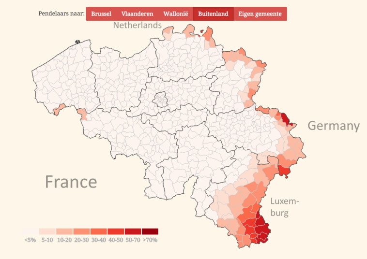
Map Info & Chart : Percentage of people regularly going to neighboring countries and back (i. e. for work)

Percentage of people regularly going to neighboring countries and back (i. e. for work)

By SteffooM

At infographic.tv we provide handpicked collection of the best infographics and data charts from around the world.

  • Sharing is caring !
  • What do you think?

    459 points
    Upvote Downvote

    Leave a Reply

    Your email address will not be published. Required fields are marked *

    Loading…

    Video Infographic : Could South America Defend Itself From a US Invasion?

    Infographic : Popular programming languages to learn in 2019