in

Map : Population change between 2010 and 2019

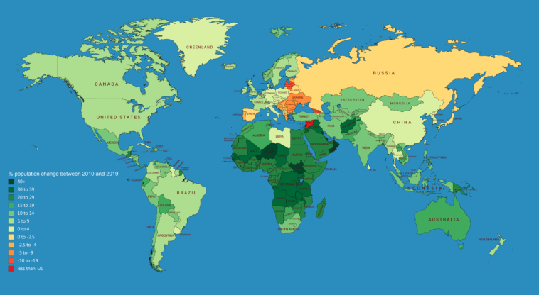
Map Info & Chart : Population change between 2010 and 2019

Population change between 2010 and 2019

By some_dawid_guy

At infographic.tv we provide handpicked collection of the best infographics and data charts from around the world.

  • Sharing is caring !
  • What do you think?

    459 points
    Upvote Downvote

    Leave a Reply

    Your email address will not be published. Required fields are marked *

    Loading…

    Video Infographic : Basics of Type Infographic

    data visualization : [OC] Mental illnesses in the tech field (link fixed)