in

Map : Population shift by decade.

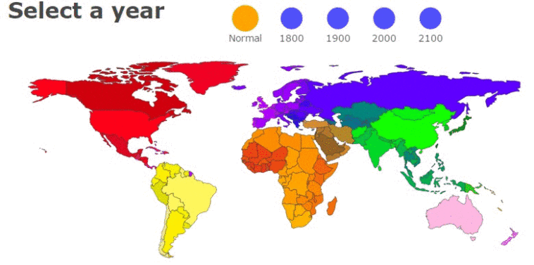
Map Info & Chart : Population shift by decade.

Population shift by decade.

By coffepotty

At infographic.tv we provide handpicked collection of the best infographics and data charts from around the world.

  • Sharing is caring !
  • What do you think?

    459 points
    Upvote Downvote

    Leave a Reply

    Your email address will not be published. Required fields are marked *

    Loading…

    Infographic : Reasons to Hire an Outsourcing Team for Mobile App Development

    Map : Iran vs. Saudi Arabia : an arm wrestling match