in

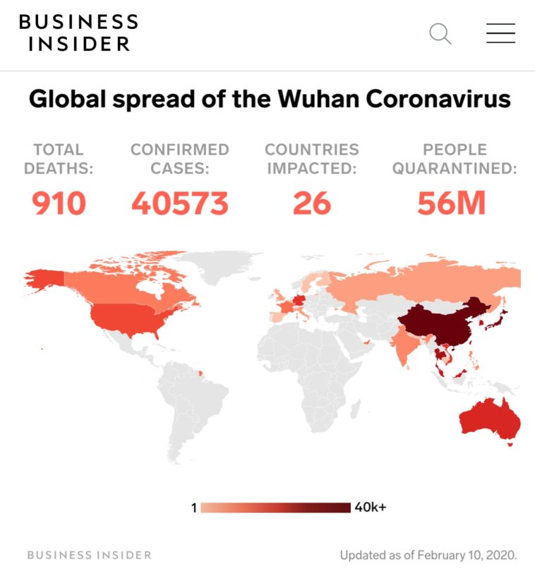
Map : This map of the spread of coronavirus is both depressingly familiar and dangerously misleading.

Map Info & Chart : This map of the spread of coronavirus is both depressingly familiar and dangerously misleading.

This map of the spread of coronavirus is both depressingly familiar and dangerously misleading.

By tinyfisch

At infographic.tv we provide handpicked collection of the best infographics and data charts from around the world.

  • Sharing is caring !
  • What do you think?

    459 points
    Upvote Downvote

    Leave a Reply

    Your email address will not be published. Required fields are marked *

    Loading…

    Map : how texas is really by a texan

    Infographic : Beginner’s Ultimate Guide to 3D Printing