Map Info & Chart : This map showing how the Irish famine affected its population
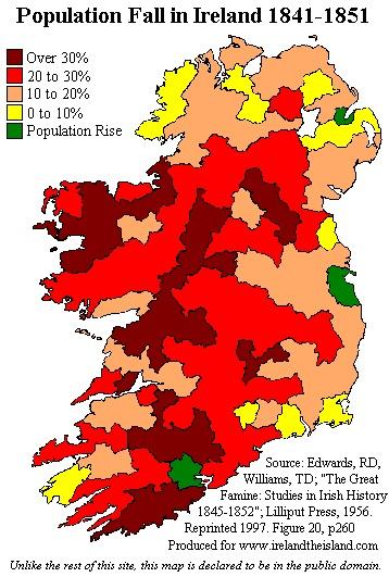
This map showing how the Irish famine affected its population
By Stucky-Barnes
At infographic.tv we provide handpicked collection of the best infographics and data charts from around the world.