Map Info & Chart : Trying to find a 2D map with proportional countries
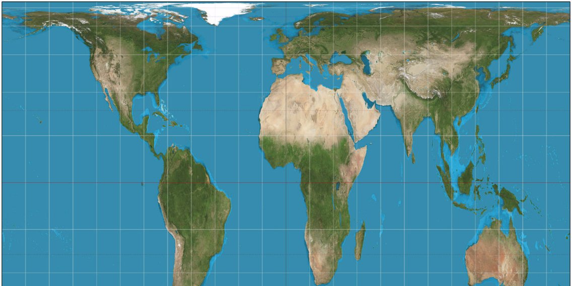
I was browsing r/Damnthatsinteresting today and came across “The UK from the ISS” post which launched me into researching a 2D map that accuratly displays the countries of the Earth without distortion of any of them except for the water. I am now familiar with the Mercator map and I personally like it because of its accuracy for navigation, however the map is dostorted and gives misconceptions to the scale towards the north and south pole making them bigger and the Gall-Peters map does the same thing but making them smaller. I found an [article talking about how a district in Boston changed to the Gall-Peters map thinking that it would be more accurate](https://www.businessinsider.com/boston-school-gall-peters-map-also-wrong-mercator-2017-3) so that students wouldn’t get misconceptions about scale and it reinforces my quest of finding one that would actually work in the class room with the correct proportions, putting navigation accuracy aside. I tried looking it up, finding [this article](http://blogs.discovermagazine.com/d-brief/2016/11/03/most-accurate-world-map/) from Discover Magazine showing a map that is still awkward and disproportionate but I found other users in the comments looking for the same thing I am. Comment 1: [http://disq.us/p/1mqbmfy](http://disq.us/p/1mqbmfy) Comment 2: [http://disq.us/p/1mo0lga](http://disq.us/p/1mo0lga)
Can anyone help me find a map like this?
By OperationRawR
At infographic.tv we provide handpicked collection of the best infographics and data charts from around the world.