in

Map : United States 2018 temperature compared to all other years

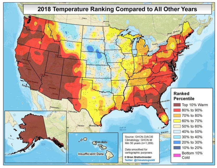
Map Info & Chart : United States 2018 temperature compared to all other years

United States 2018 temperature compared to all other years

By AJgloe

At infographic.tv we provide handpicked collection of the best infographics and data charts from around the world.

  • Sharing is caring !
  • What do you think?

    459 points
    Upvote Downvote

    Leave a Reply

    Your email address will not be published. Required fields are marked *

    Loading…

    data visualization : Search volume for International Men’s Day peaks every International Women’s Day. [OC] but this phenomenon has been visualised many times before by others!

    Data Chart : In Cold Blood – Original True Crime Story Analyzed [Infographic