Map Info & Chart : What We Thought The World Map Looked Like: Every Year
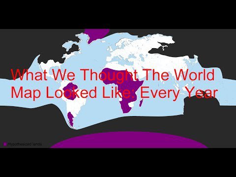
What We Thought The World Map Looked Like: Every Year
By blogueandoatope
At infographic.tv we provide handpicked collection of the best infographics and data charts from around the world.