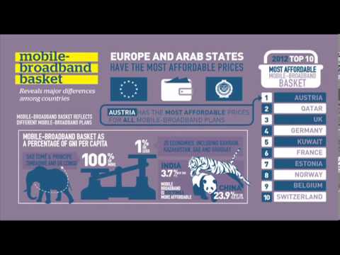
in Videos Infographics Video Infographic : MIS2013 REPORT Infographic February 9, 2019, 7:51 am 20.6k Views 0 Comments Video Infographic : MIS2013 REPORT Infographic Video Description Video infographic created from the statistics of the Measuring The Information Society 2013 Report. Don’t forget to share this video with your friends ! 0 shares What do you think? 459 Points Upvote Downvote Leave a Reply Cancel replyYour email address will not be published. Required fields are marked *Comment * Name * Email * Website Next post
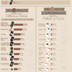
Visual : Which beverages have the most caffeine per ounce? (includes energy drinks, coffee, tea, soda, etc.)