Video Infographic : Super Beautiful Infographic Design in Microsoft Office PowerPoint (PPT)
Video
Description
PowerPoint is an enterprise level software and an amazing product of Microsoft Office. It has a great potential and the kind of features it provides are so easy to understand and simple to use that every student, manager, marketing executive or sales guy can easily create brilliant professional presentations. Microsoft Office PowerPoint is often underestimated but it allows us to create presentations, logos, banners, templates, designs, graphics, and most importantly video animations.
A PowerPoint Presentation designed appropriately can really convince your target audience. A lot of design thinking needs to be put into a slide to make sure that the message is clearly delivered to the user.
I have created all the videos in PowerPoint included in Microsoft Office 365 suite. My idea is to help my audience learn the PowerPoint and get to know how easy it is to create anything in presentation.
Please Subscribe to our channel:
You can download all the professional PowerPoint templates that I have created from the following URL:
I have created the playlist of all the PowerPoint Training Videos. You can visit the URL:
About this Microsoft Office PowerPoint 365 Training Video:
Super Beautiful Infographic Design in Microsoft Office PowerPoint (PPT).
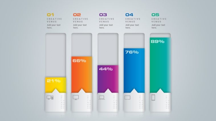
This video is about designing an infographic by using the features of PowerPoint (PPT). This video uses rounded square shapes to create the graphics.
I hope you like this MIcrosoft Office 365 PowerPoint Training Video.
Please Like, share, comment and subscribe to watch more such videos.
Follow Us on Google Plus:
Follow Us on Twitter:
Follow Us on Facebook: