Data visualization : [OC] A heat map of Tinder activity using volume of messages sent at each time/date combination from a sample of a group of my friend’s Tinder data as a proxy.
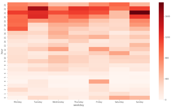
[OC] A heat map of Tinder activity using volume of messages sent at each time/date combination from a sample of a group of my friend’s Tinder data as a proxy.
By jackcballinger
At infographic.tv we provide handpicked collection of the best infographics and data charts from around the world.

