in

Video Infographic : Creating maps for infographics 101- Part 2 of 3

Video Infographic : Creating maps for infographics 101- Part 2 of 3

Video

Description

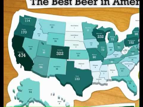
Part 2 of 3. A tutorial that explores color systems and plotted points on SVG maps Adobe Illustrator. We look at and create US election map and examine intensity/heat, and plotted points on maps display data. The power of the marketing concept of “State Love” is discussed and case studies of “Our Flag: A Graphical History of the US Flag”, “Best Beer in America 2008”, “The United States of Cornbread” maps are explored.

  • Don’t forget to share this video with your friends !
  • What do you think?

    459 points
    Upvote Downvote

    Leave a Reply

    Your email address will not be published. Required fields are marked *

    Loading…

    data visualization : [OC] A heat map of Tinder activity using volume of messages sent at each time/date combination from a sample of a group of my friend’s Tinder data as a proxy.

    Data Chart : Infographic: A Guide to Summer Foods