Map Info & Chart : vintage maps with added shadows look pretty sick

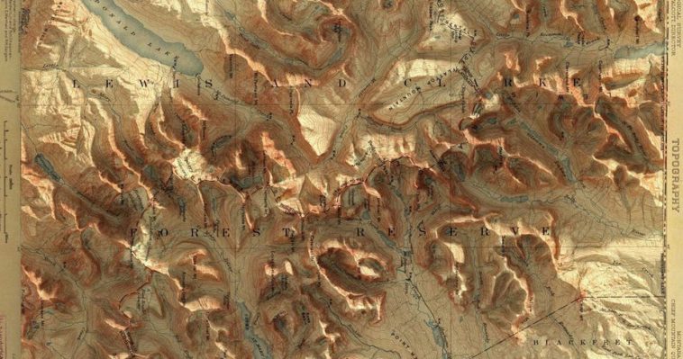
vintage maps with added shadows look pretty sick
By corgitea
At infographic.tv we provide handpicked collection of the best infographics and data charts from around the world.

Here you'll find all collections you've created before.